



Habits
Stripping Away the Noise of Habit Formation
At a Glance
Role
Solo Product Designer & Researcher
Timeline
12-Week Academic Term, 2024
Tools
Figma, Figjam, Google Docs, Google Forms, Notion
Project Overview
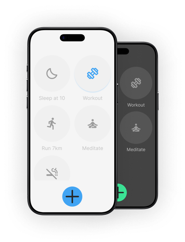
Most habit apps guilt users into consistency with streaks and constant notifications. It usually backfires, especially for burnt-out professionals. I researched why, then designed Habits around one principle instead: encouragement over expectation. The result is a structured UI kit with interactive light and dark mode prototypes, built around calm, non-judgemental progress cues grounded in habit formation science.
Design Goal
Build a habit ecosystem that supports long-term consistency through digital minimalism.
Process Goal
Get hands-on with end-to-end UX methodology and more advanced Figma component architecture.
Research & Discovery
Problem Statement
Professionals with demanding schedules struggle to build consistent, healthy habits. They want to improve their routines, but get derailed by a lack of time and by apps that rely on constant notifications to keep them engaged.
Research
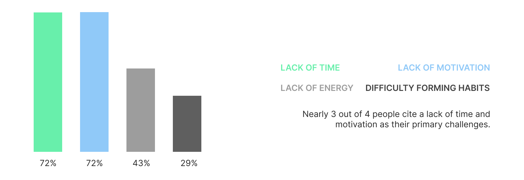
My survey identified two clear friction points: lack of time and notification fatigue. But the sample skewed toward people already interested in wellness apps, so I didn't fully trust it on its own. I checked it against habit-formation literature and a review of competitor apps before treating it as a real basis for design decisions.
What are the biggest challenges you face in maintaining these wellness habits?
What do users actually want from a wellness app?
One response stuck with me: "It should be visually appealing and not constantly nag me to open it up." That's basically the brief I ended up designing to.

Key Findings
The 66-Day Baseline
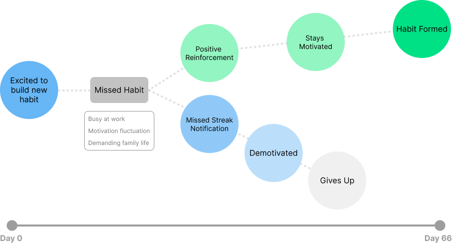
According to the NHS and European Journal of Social Psychology it takes an average of 66 days to form an automatic habit.
The Design Mandate: The app must organically sustain motivation for over two months.
Notification Fatigue
Survey respondents named intrusive notifications as a major reason they abandon habit apps. Competitor research backed this up: punitive tracking (streak loss, guilt-based nudges) tends to create the exact friction it's meant to prevent.
ideation
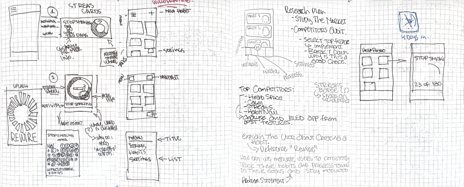
Sketching Ideas
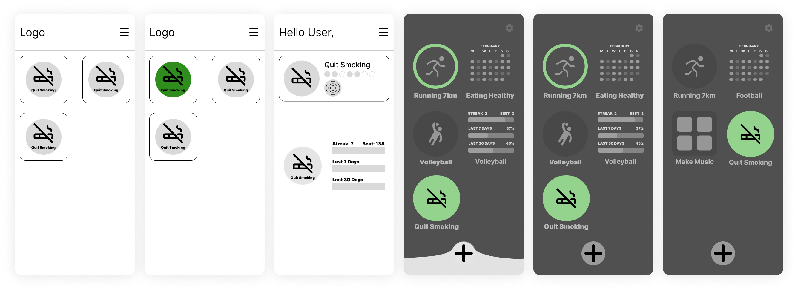
The final minimalist design wasn't the first idea. It came from testing a few directions, seeing what didn't work, and cutting anything that added friction rather than removing it.
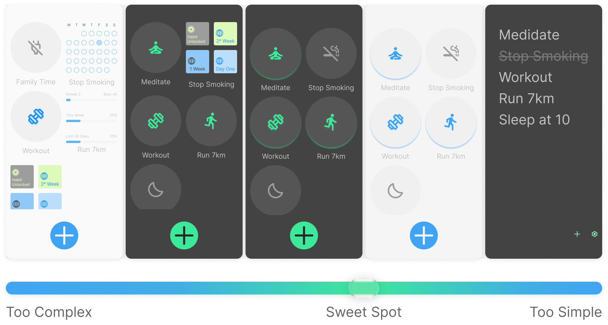
Finding the UX Sweet Spot
Early prototypes went too far in both directions, one version was fully customisable but took too long to set up, another was a text-heavy to-do list that felt like a chore to open. The final design locks in the layout so there's no setup time, while keeping the interface visually engaging enough to want to open.
from findings into interface
Design Guidelines
I wanted the interface to feel supportive rather than like another source of digital fatigue, so I built the design system around calm and function first.
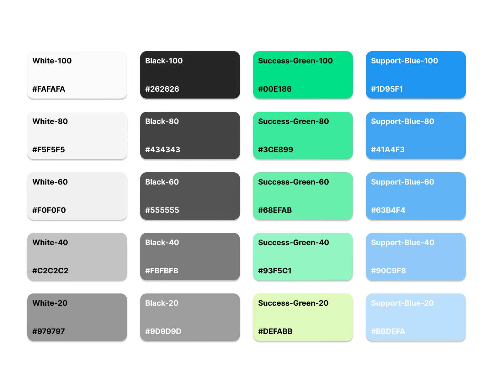
This palette leverages colour psychology to promote calmness and trust, using a neutral foundation to reduce visual fatigue and specific green and blue accents to highlight achievements
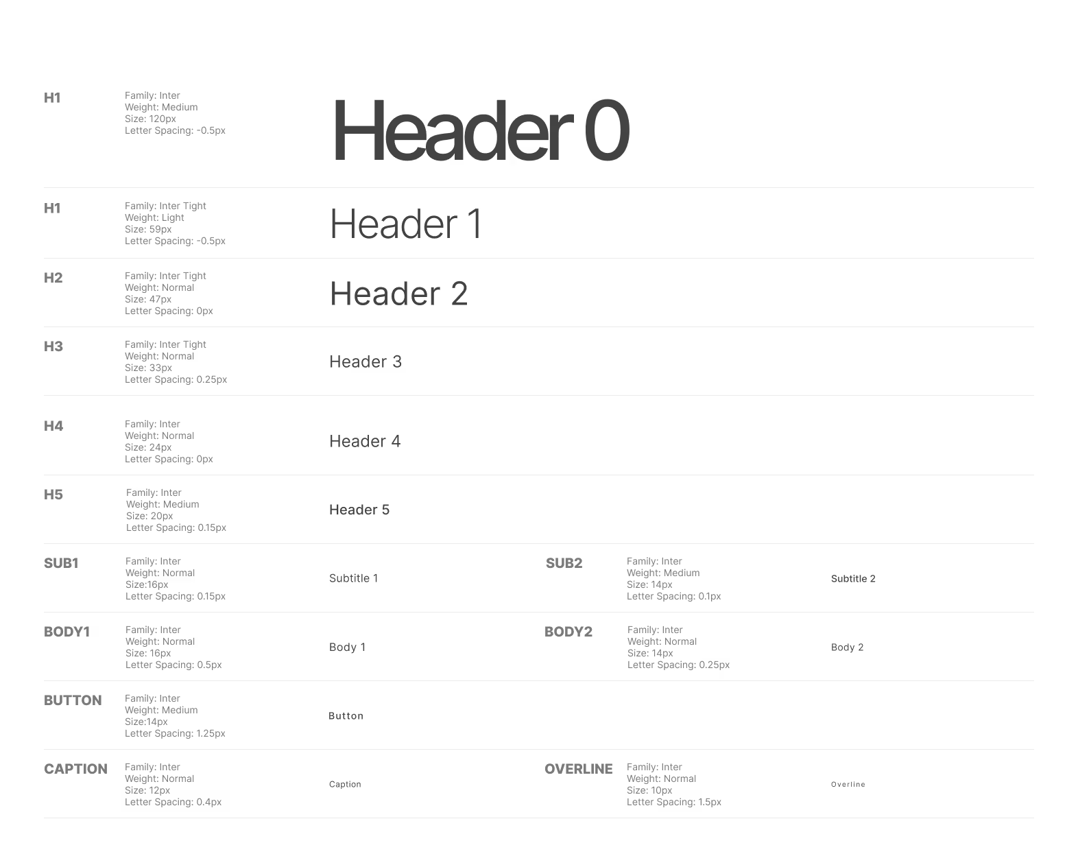
Inter was selected because its clean, highly readable form ensures the text remains purely functional and never competes with the app's primary iconography
Key Features
The Solutions
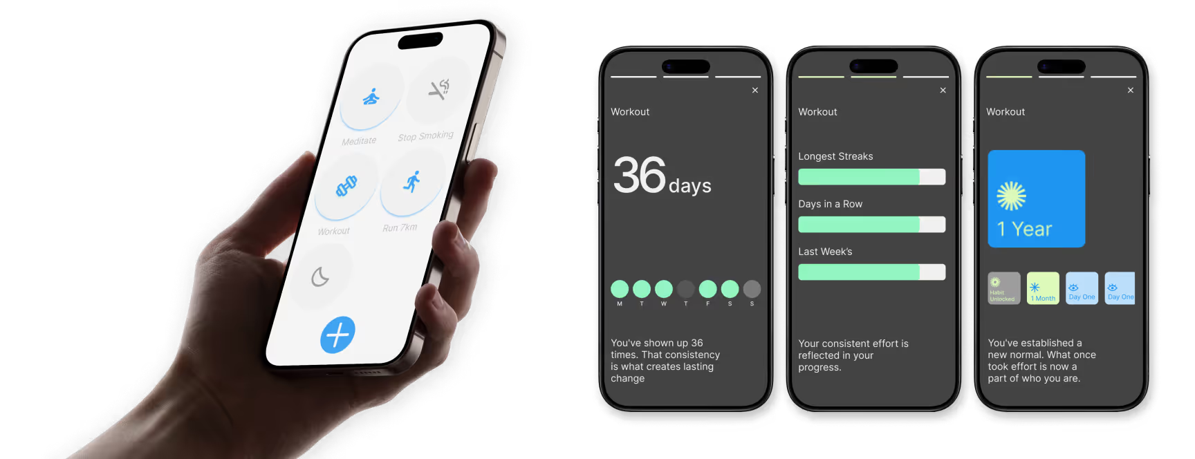
The final high-fidelity interface focuses on three core touchpoints designed to directly solve the problems discovered in the research.
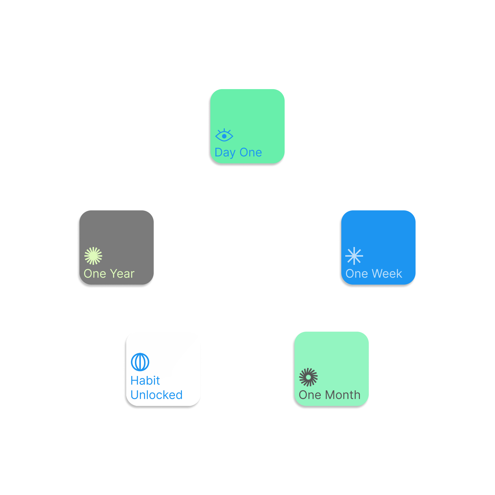
Empathetic Gamification
The Solution
Replacing streak-loss mechanics with a reward system that celebrates weekly consistency and personal bests, rather than punishing a missed day.
The Rationale
Punishing a missed day creates guilt, which works against the motivation someone needs to actually reach the 66-day threshold. Positive reinforcement holds up better over that timeframe.
Business Impact
Protects the user's relationship with the app, which supports the kind of long-term retention that guilt-based streaks tend to undermine.
Visual Completion Loops
The Solution
Circular completion rings instead of standard linear progress bars
The Rationale
Behavioural science shows that completing a full circle is a small, satisfying moment that a linear bar doesn't give you in the same way.
Business Impact
Encourages daily engagement without needing aggressive push notifications to do the same job.
"Story-Style" Analytics
The Solution
Replacing infinite-scroll dashboards with a quick, "story-style" progress overview accessed via a single long-press
The Rationale
It borrows a familiar, fast content format people already use daily, so checking progress feels quick rather than like opening a report.
Business Impact
Gives useful insight in a few seconds, without asking for more attention than the moment deserves.
Measuring Success
This was a conceptual project, testing whether a more ethical approach to engagement could still hold someone's attention. In a live environment, I'd measure it against:
Usability & Friction Metrics
Measuring the average time taken for a user to open the app, mark a habit as complete, and exit.
Long-Term Retention Rate
Tracking the percentage of users who remain actively engaged past the critical 66-day "Habit Formed" milestone.
reflection
Psychology & Minimalism
Researching habit formation changed how I thought about motivation. I went in assuming more engagement features would help. The research pushed me the other way; the most useful thing I could design was less, not more. Locking down customisation options was the hardest call to make, since it went against my instinct to give users control. It ended up being the right one.
Practical Execution
I became passionate about experience design reading Don Norman and Cliff Kuang, fascinated by how much impact the right solution can have. Habits was my first end-to-end product design project, and I chose to solve a problem I was living myself: building and maintaining habits. What I didn't expect was how much the research would push back on my assumptions, my own recruitment fell short of my target demographic, which forced me to lean on competitor analysis and clinical literature instead, and ultimately shaped a more evidence-grounded design than a handful of easy interviews would have.