




Centralising a Fragmented Digital Ticket Platform & Community

At a Glance
Role
Solo Product Designer (End-to-End)
Timeline
12-Week Academic Term, 2026
Tools
Figma, Google Antigravity, Illustrator, Blender
Project Overview
This case study is two experiments in one.
The first: fixing a ticketing system that relied on third-party platforms the festival never owned, which meant 88% of ticket attempts were abandoned before completion.
The second: testing whether an AI-enhanced design workflow could solve it faster, without cutting corners on research or craft.
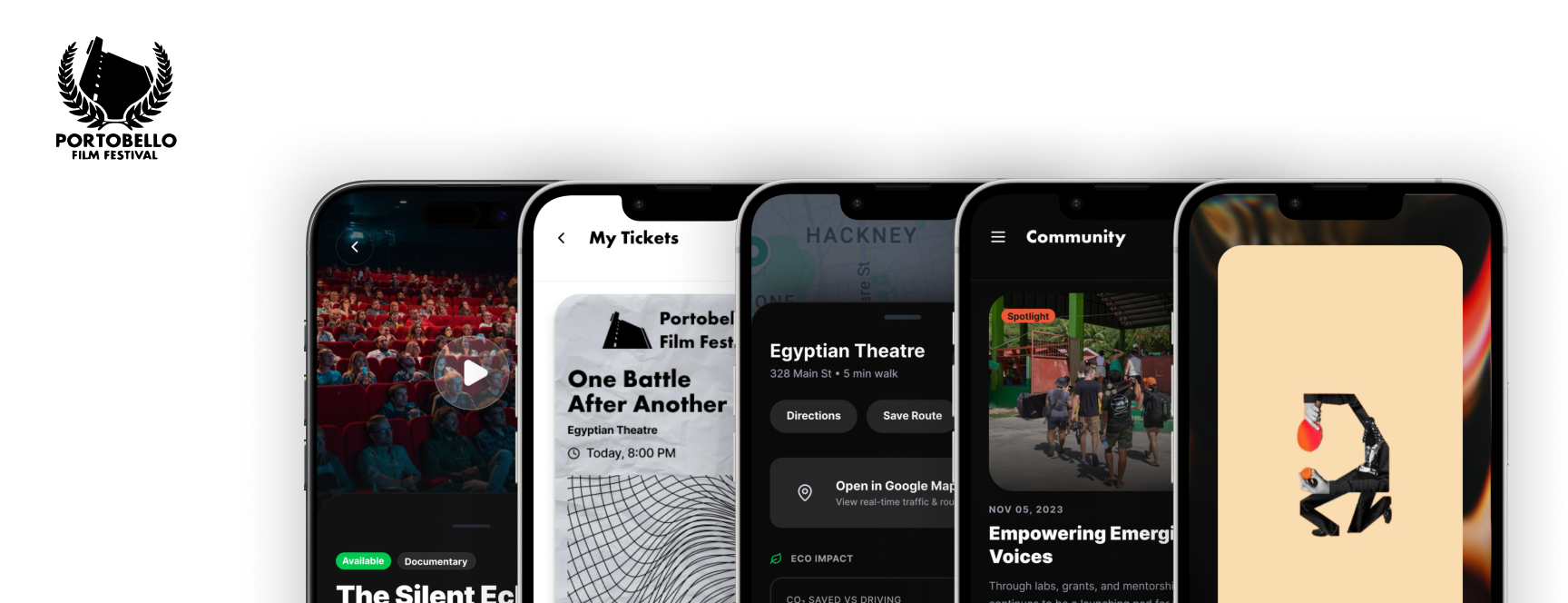
One became a centralised mobile app, custom rMQR assets, and an offline kiosk. The other became a process I'd build on and bring to every project after this one.
Design Goal
Build a centralised mobile app that removes booking friction and lets the festival retain its own community data.
Process Goal
Test whether an AI-enhanced workflow could speed up design exploration without cutting corners.
Research & Discovery
Problem Statement
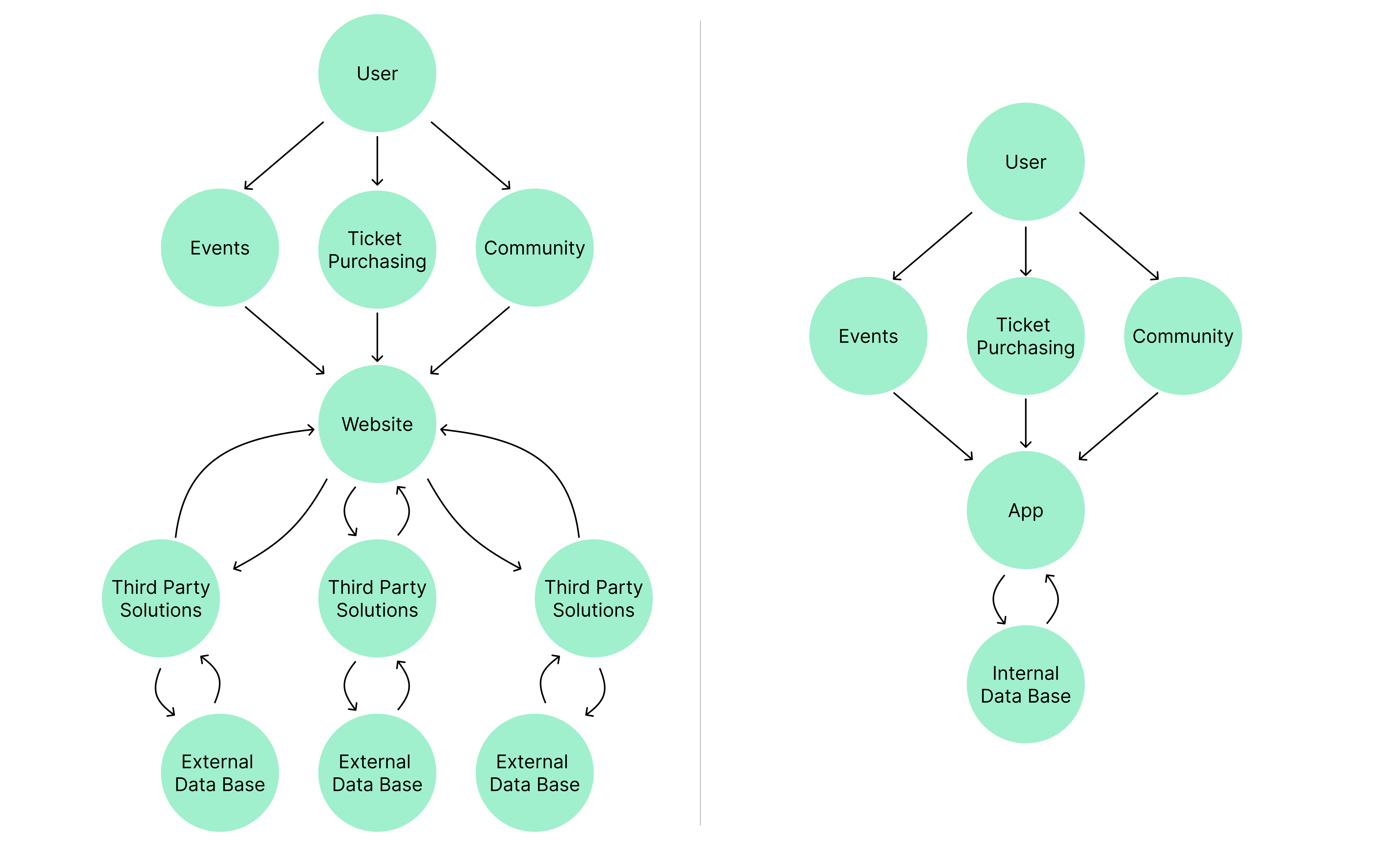
Portobello Film Festival depends on a fragmented set of third-party platforms for ticketing and community engagement. That creates real friction for attendees, and it means the festival has no way to retain its own audience data.
Competitor Audit
An audit of major cultural and film festival platforms revealed that treating digital touchpoints as a unified engine for community communication and native ticketing is not a bonus feature, it is the baseline industry standard.
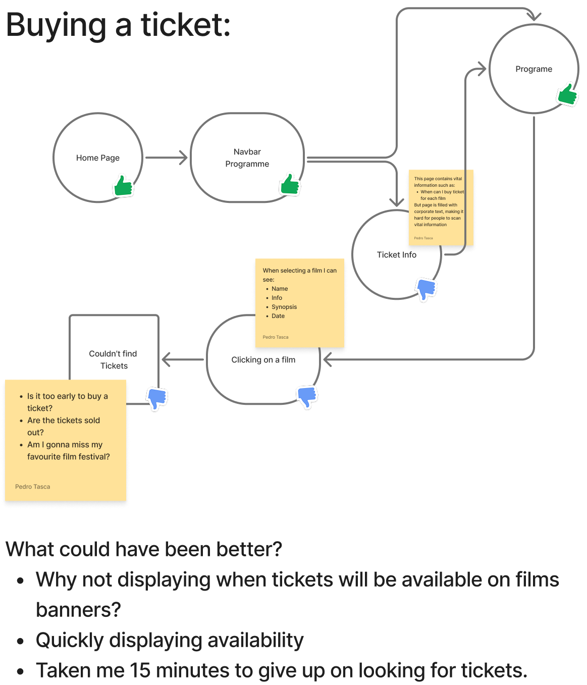
Quantitative Data
To map broader audience behaviour, I ran a survey across several cultural event communities, looking at how independent-media attendees actually discover and book events.
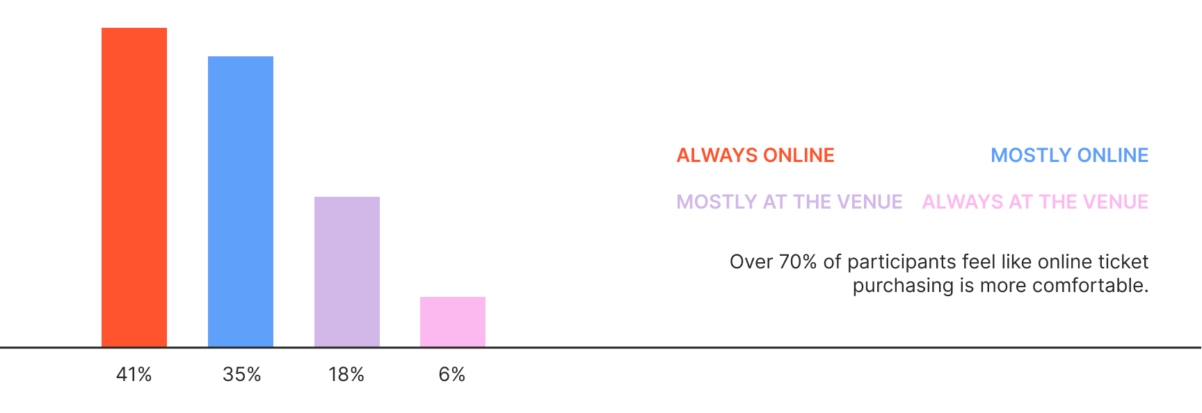
Do you prefer to buy tickets online in advance or at the physical venue?
Have you ever abandoned a ticket purchase because the website redirected you to a external platform?

Key Insights From Research
76% of participants said online booking is their first choice. But 88% had abandoned a ticket purchase specifically because a redirect sent them to an external platform mid-way through. That gap, people want to book online but the current flow is actively pushing them away, became the core problem this project set out to fix.
Understanding Our Users
Based on those insights, I built two contrasting personas to act as constraints on the layout:

One wants fast, high-velocity interactions and to feel part of an exclusive cultural scene.
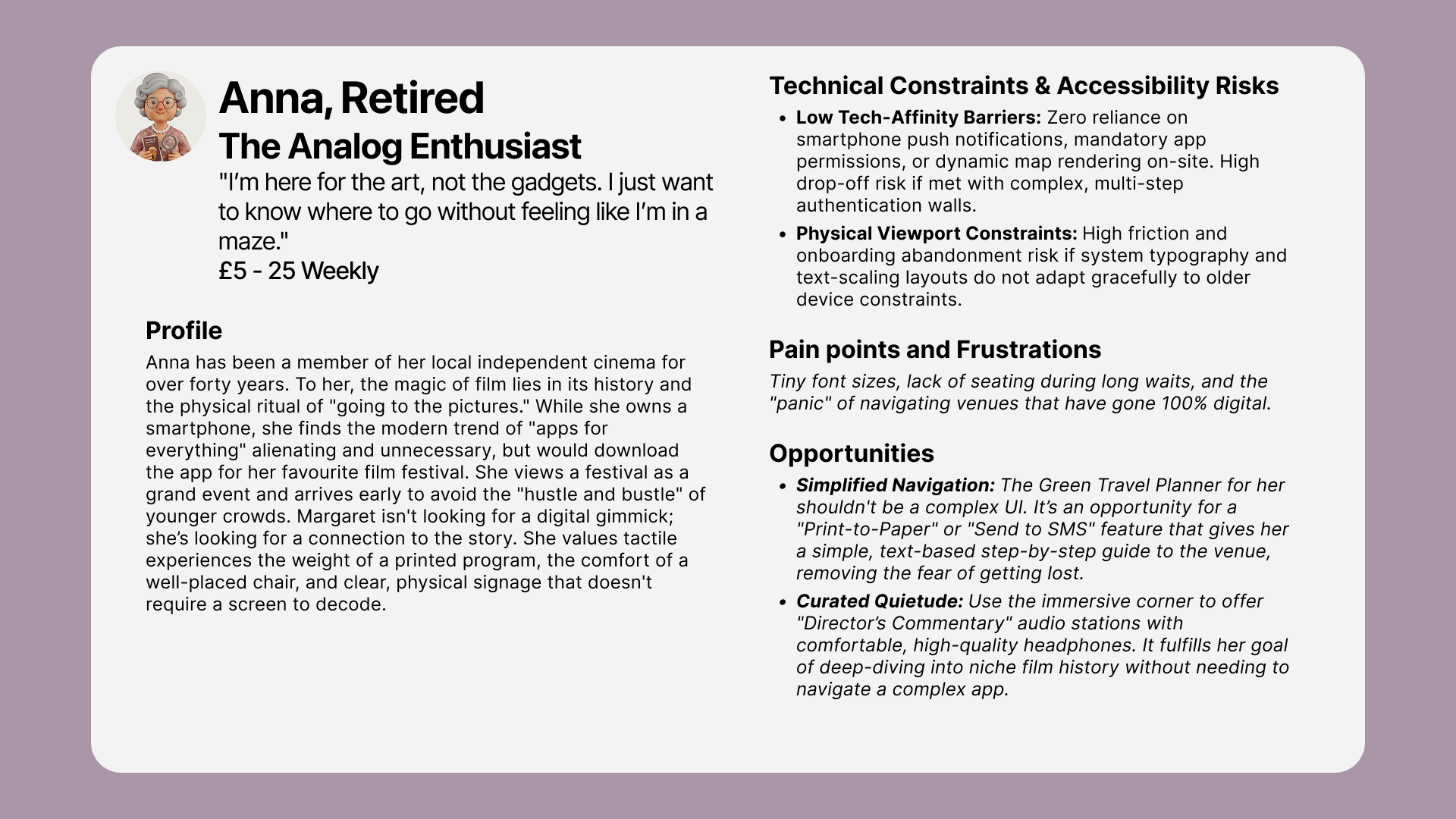
The other wants visual simplicity, high-contrast type, and a straightforward path through the app.
ideation
Accelerated Prototyping
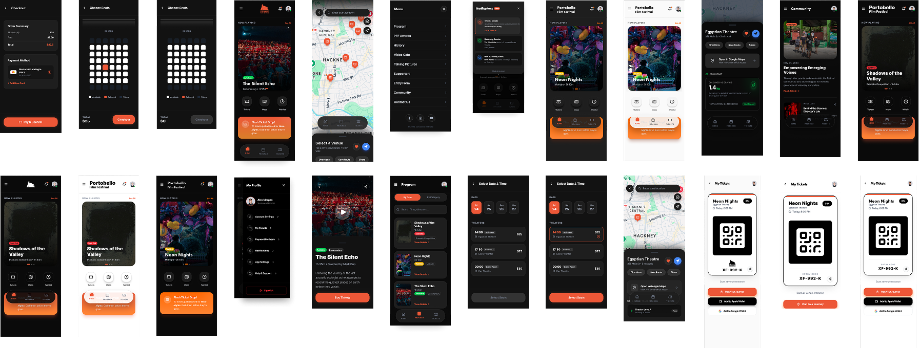
Instead of starting with isolated paper wireframes, I used an AI-assisted layout workflow in Figma Make to generate and stress-test structural UI components quickly. It compressed the early wireframing cycle, without skipping the testing that normally happens at that stage.
User Testing
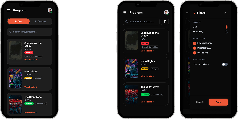
To stress-test those early layouts, I ran a service role-play and co-creation workshop with peers, working through where the flow created friction.
That session surfaced a real problem: the automated search flow was too rigid. It forced people down one linear path, which made finding a specific event frustrating.
service mapping
Structural Service Architecture
Before styling any components, I mapped the operational needs of the app using an extended service blueprint. That grounded the user flows against what was actually needed on the backend, not just what looked good on screen.
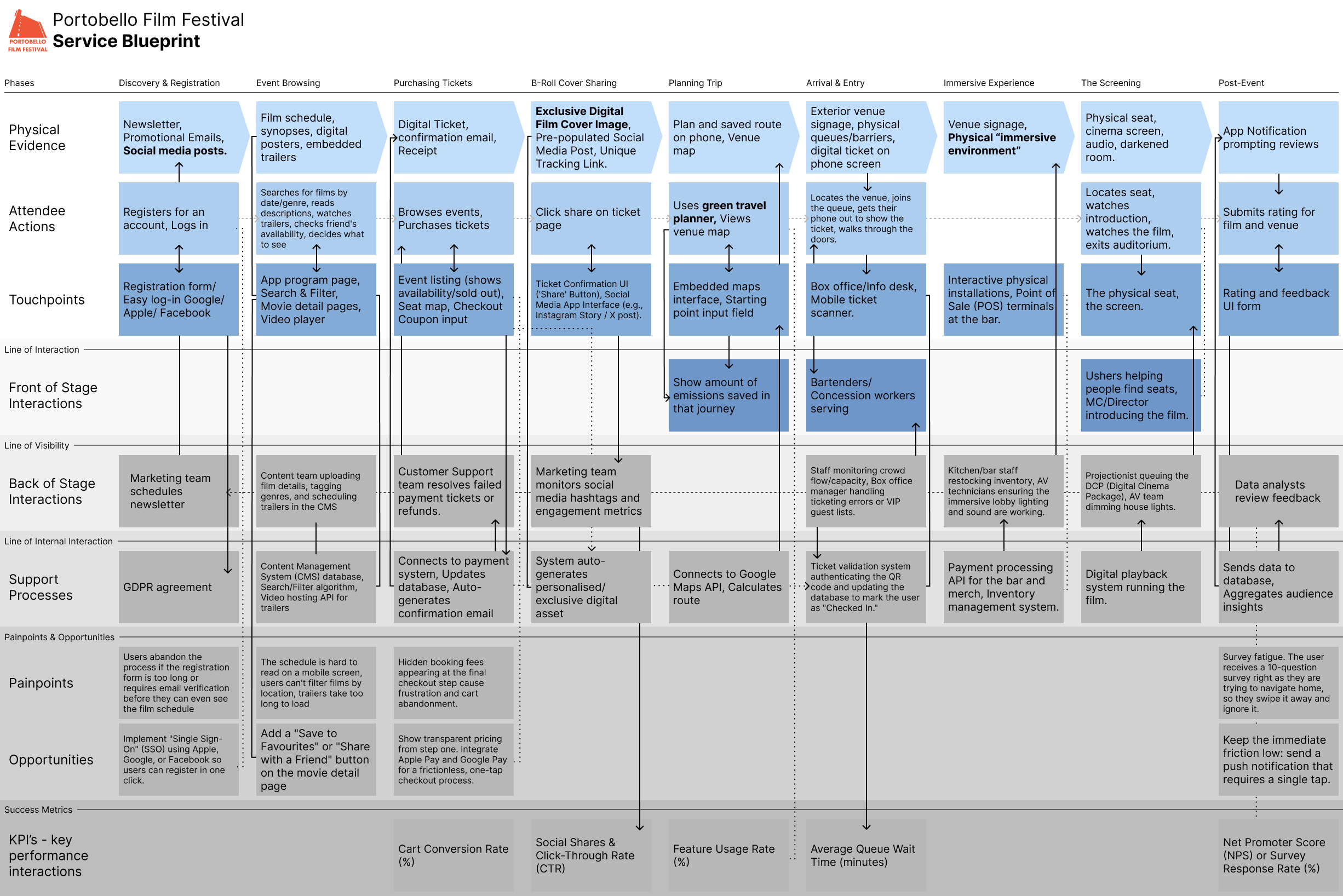
Systems Integration: Mapped a 9-stage service ecosystem tracking attendee touchpoints directly down to backend support layers, including the CMS database, Google Maps API, and GDPR agreements.
Business Accountability: Extended standard mapping layers to include KPI's. Connecting features like the Organic Cover Share directly to targeted Cart Conversion Rates (%) and Social Click-Through Rates (CTR).
from findings into interface
Design Guidelines
I used Figma Make to test structural layout options quickly. Once the structure was validated, I set clear design guidelines to balance the festival's identity with accessibility standards.

Futura PT, the typeface from PFF's official logo, is used for main headers to keep the app tied to the festival's independent, historic visual identity.

Inter is used for section titles and body copy, for contrast, scan speed, and to scale properly on smaller mobile screens.
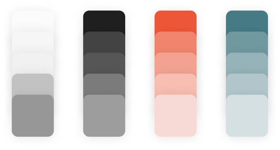
Colours are sampled directly from PFF's current website, so the app stays recognisable to the existing community, with contrast adjusted to meet accessibility standards.
Key Features
The Solutions
The high-fidelity interface focuses on the touchpoints that directly address the research findings above.
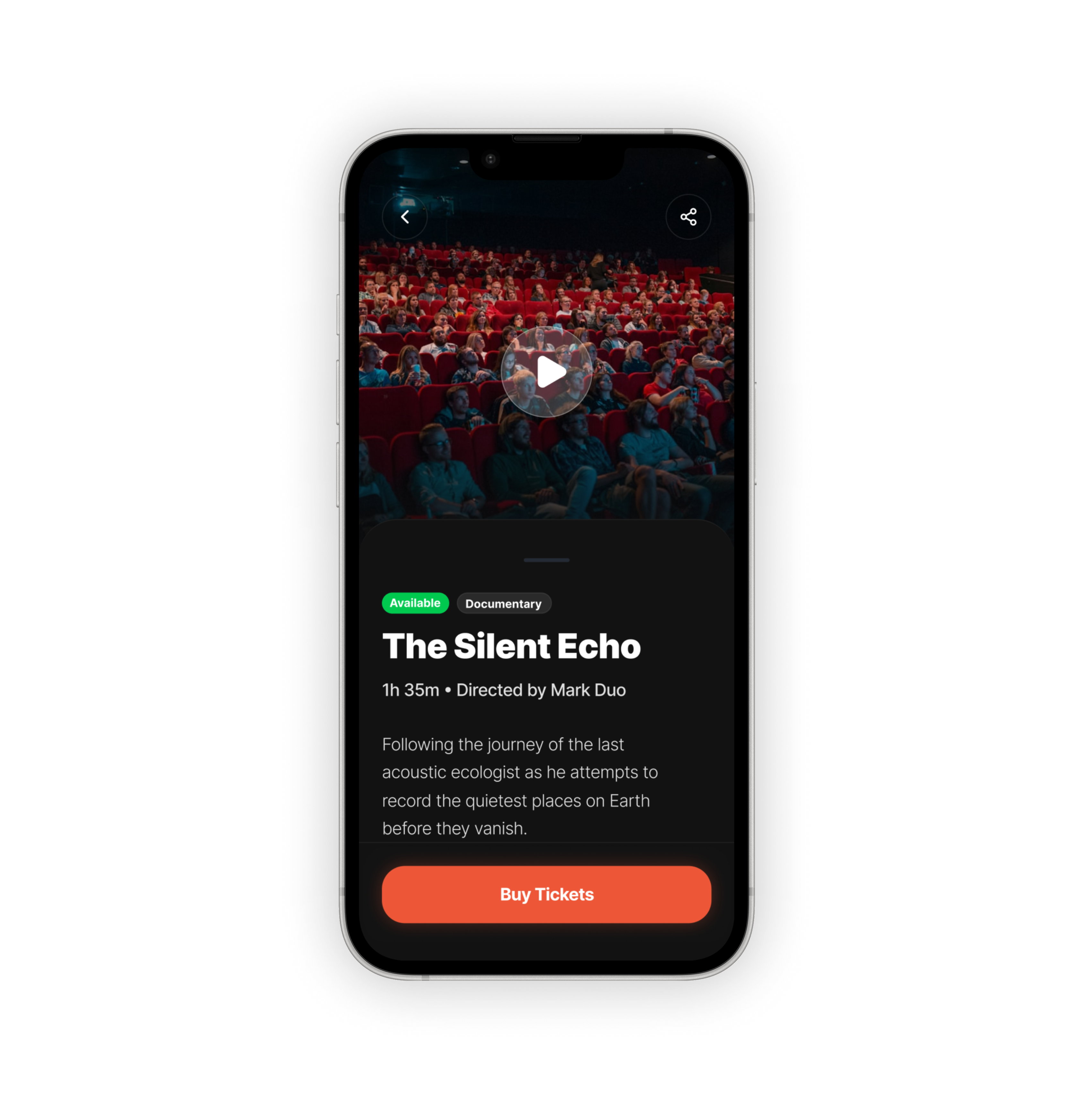
Internal Ticketing Engine
The Solution
A fully native checkout flow keeping the purchase inside the app
The Value Metric
Removes the redirect friction for attendees, and gives the festival the user data retention it never had
Target KPI: Cart Conversion Rate (%)
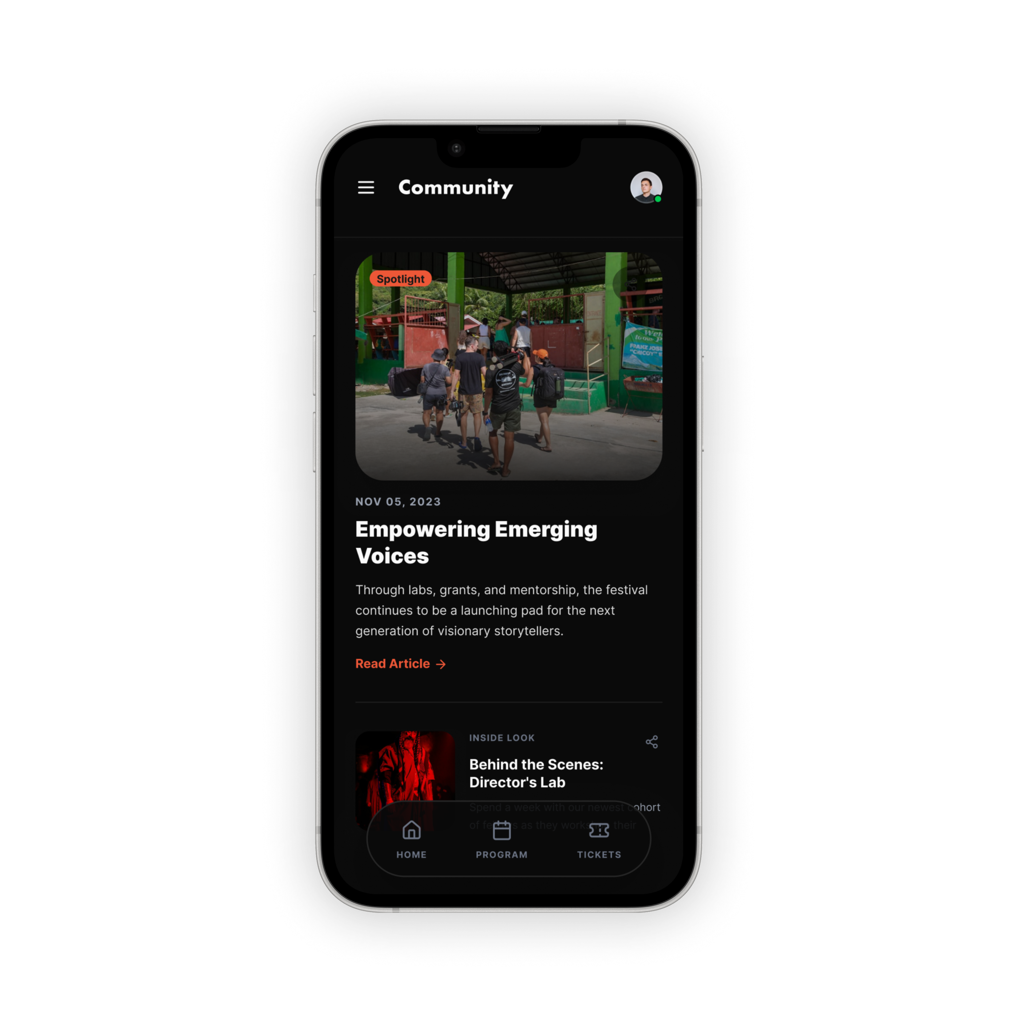
Centralised Community Hub
The Solution
A dedicated space for official updates and communication streams
The Value Metric
Keeps followers engaged inside the product instead of scattered across third-party channels
Target KPI: Click-Through Rate (CTR)
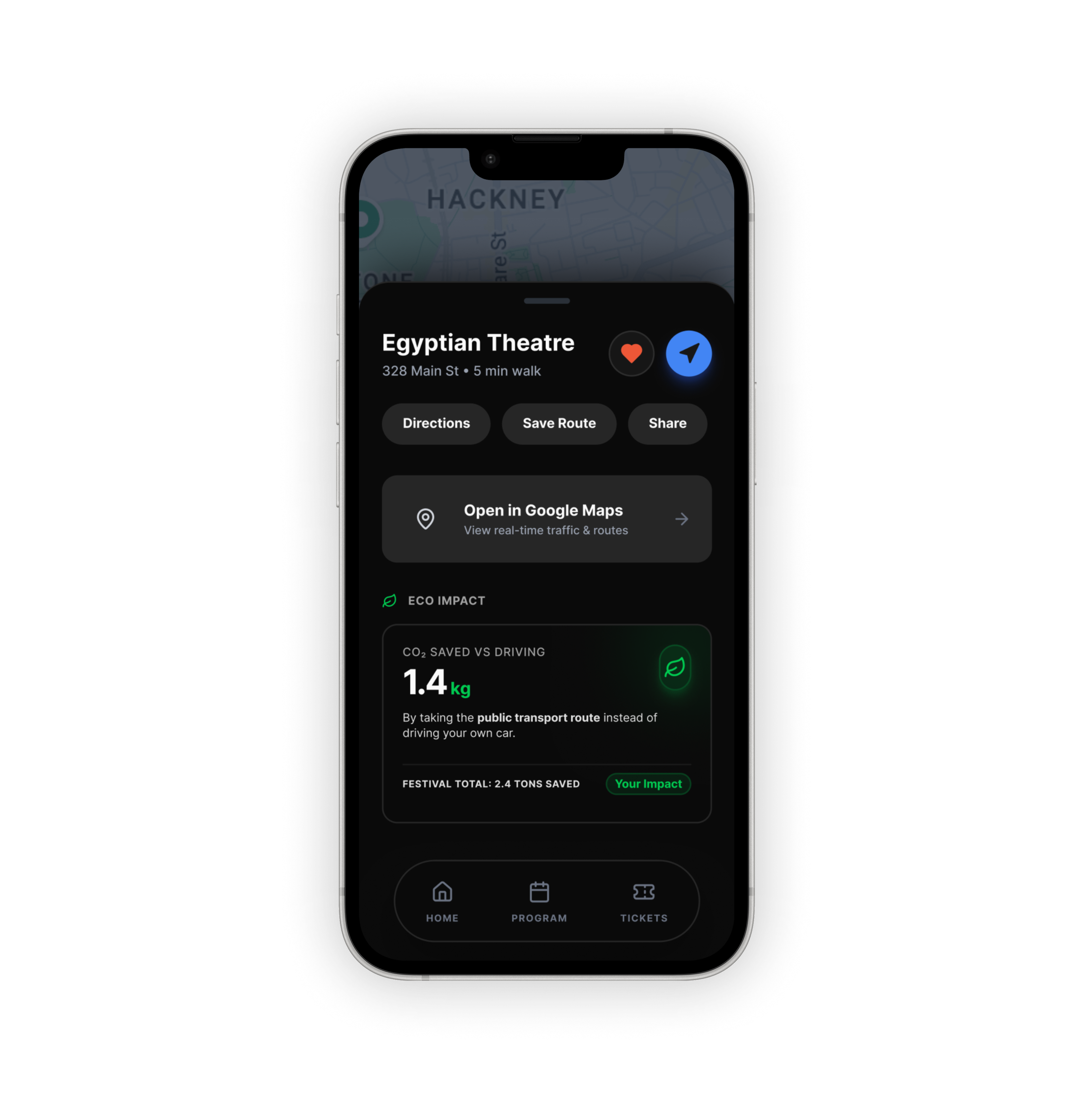
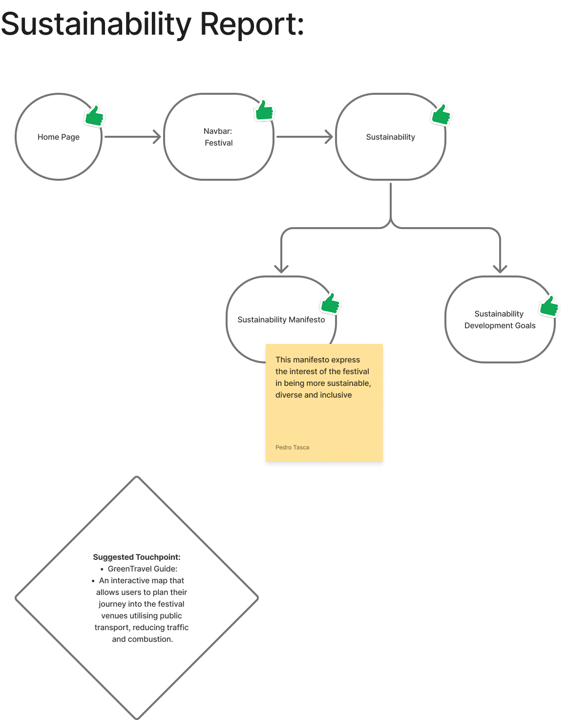
Sustainable Travel Planner
The Solution
An integrated routing tool that calculates public transport paths between the festival's scattered venues
The Value Metric
Helps attendees navigate physical locations easily, while actively highlighting the festival's sustainability goals
Target KPI: Feature Usage Rate (%)
Growth Loop
Designing for zero-budget growth. Beyond reducing user friction, the app taps into the festival's existing creative community to turn attendees into advocates, without a marketing spend.
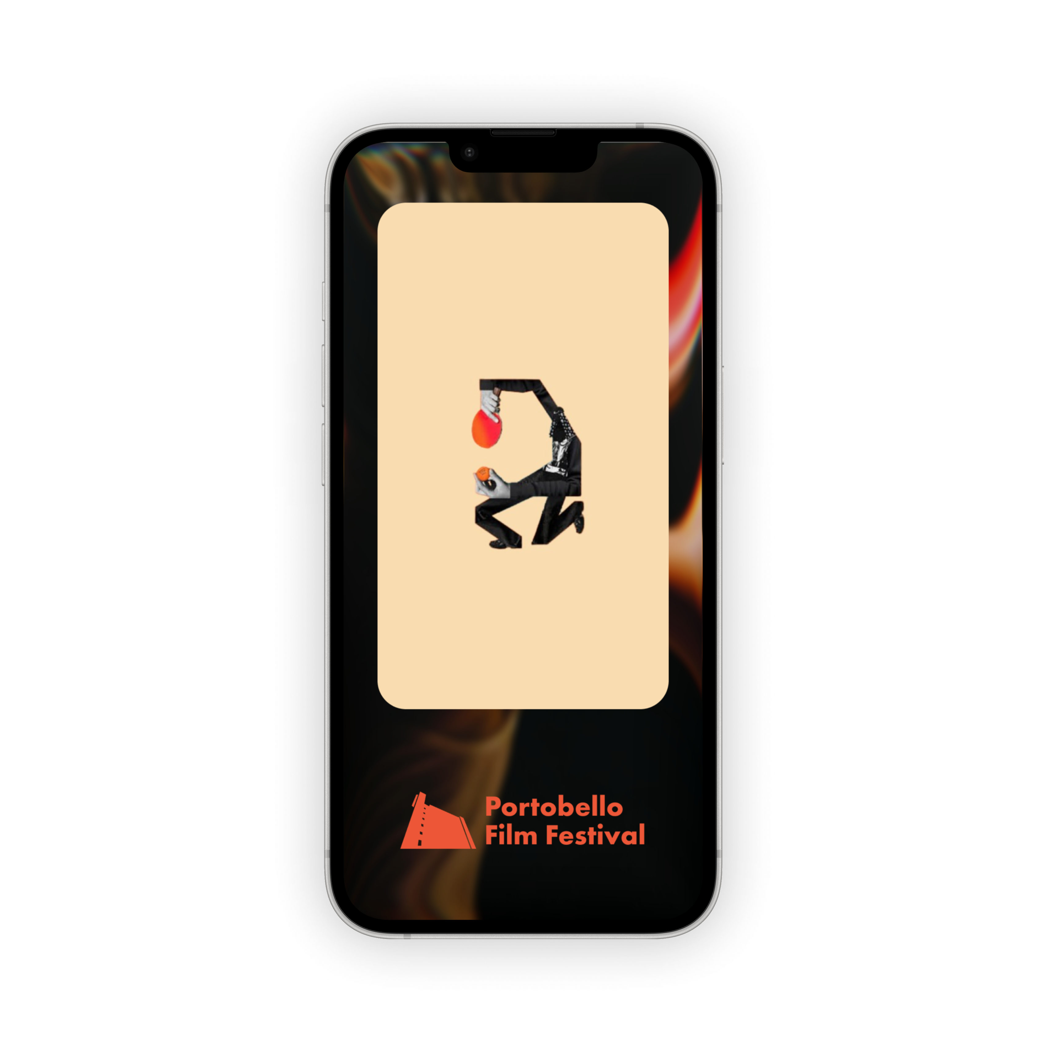
Organic Marketing Loop
The Solution
Rewards attendees with an exclusive alternative film cover, created with local independent artists, instead of a generic promotional template.
The Value Metric
Drives free organic reach and deepens engagement across the community, with no added ad spend.
Target KPI: Organic Social Shares & Referral Registrations
further exploration
Spatial Prototyping & App Scaffolding
This gave me space to test two things outside the core app: physical touchpoints using Blender, and how far AI tooling could go with front-end scaffolding.
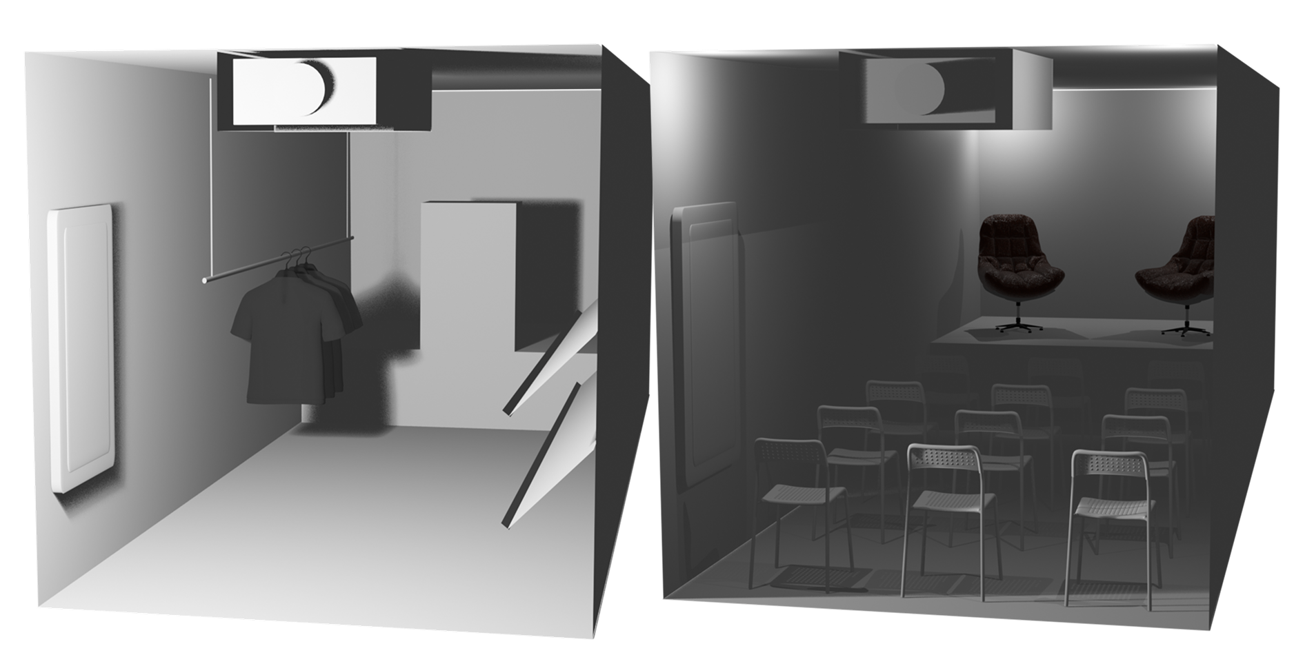
I modelled a physical, hybrid installation for outdoor festival events, a single spot for merchandise sales, live director Q&As, and external film projections.
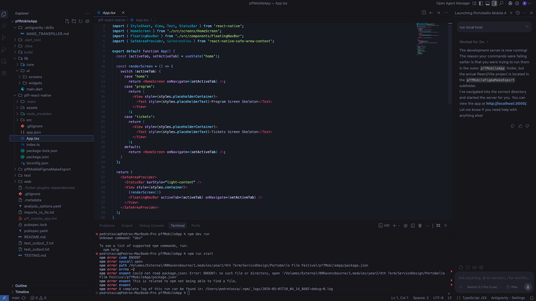
I also used Antigravity to test exporting the Figma Make prototype into a responsive React front-end shell.
reflection
Embracing Modern Workflows
Before this project, I'd avoided automated design tools entirely. Using Figma Make to clear out baseline layouts fast freed up time for the parts that actually needed my judgement, the service blueprint, the user testing, the KPI mapping. I came away convinced AI tools can genuinely speed up production, but only when paired with real human critique. Left on their own, the first automated search flow was too rigid, and it took the workshop with peers to catch that.
Designing for Business Objectives
This wasn't a conceptual student brief, it had a real client and real constraints. Every interface decision had to justify itself against an actual metric: checkout conversion, data retention, or turning the Alt-Cover feature into a genuinely zero-cost acquisition channel. That shift changed how I think about design decisions generally, not just for this project.
The Power of System Mapping
Mapping PFF's fragmented infrastructure taught me that good UX isn't just about the screens. It's about understanding where a business is actually losing money or time, and designing something that fixes that, not just something that looks good.