


Role:
Solo UX/UI Designer (Concept, Research, and Final Design)
Timeline:
12 Weeks
Tools:
Figma, Notion, Microsoft Forms
The Pitch
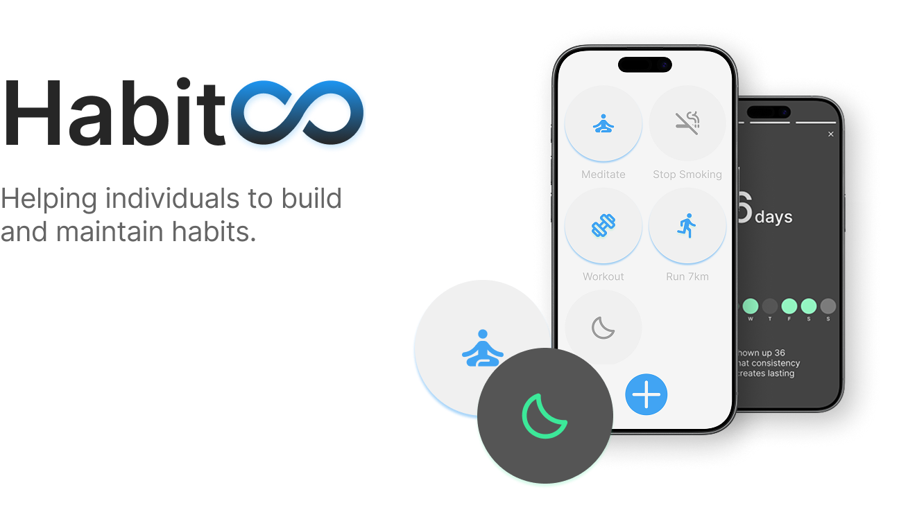
Habits is an intentional, minimalistic habit tracker designed to help busy, hyper-connected adults build healthy routines without increasing their anxiety or screen time. Grounded in behavioural psychology, the app replaces overwhelming data dashboards with quick, rewarding interactions to create a frictionless experience.
Key Highlights
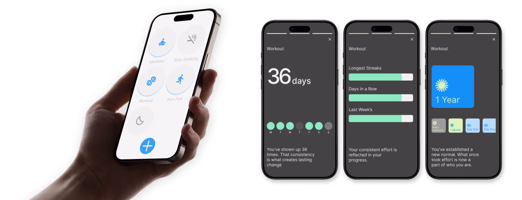
Story-Style Stats: To minimise in-app time, I replaced traditional data dashboards with a tap-and-hold "story" feature that delivers quick, digestible insights.
Mindful Gamification: Designed a custom, flat-design badge system that rewards user consistency without the toxic pressure of breaking a streak.
Developer-Ready System: Built a robust, accessible design system in Figma, mastering Auto Layout, variables, and component architecture for a seamless handoff.
At a Glance
Overview & Problem Statement
Habits was my first end-to-end UX project, tackling the real-world problem of building healthy routines in an era of anxiety and hyper-connectivity. The goal was to craft an intentional, minimalistic habit tracker grounded in behavioural psychology and system design.
The Challenge
How do we design a digital product to reduce screen time and anxiety without becoming just another app demanding the user's attention?
To answer this, I stablished four guiding principles:
Calm over Chaos: Visually light interfaces that reduce cognitive load.
Encouragement over Expectation: Rewarding meaningful progress without punishing users for missing a day.
Life-Fitting Design: Adapting to the user effortlessly.
Transparency and Trust: Intuitive flows with zero manipulative UX patterns.
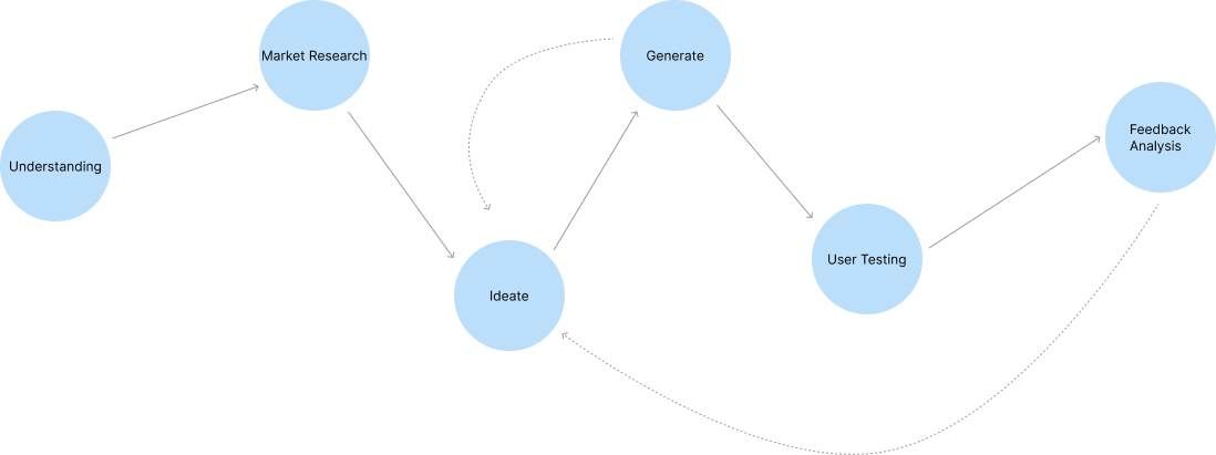
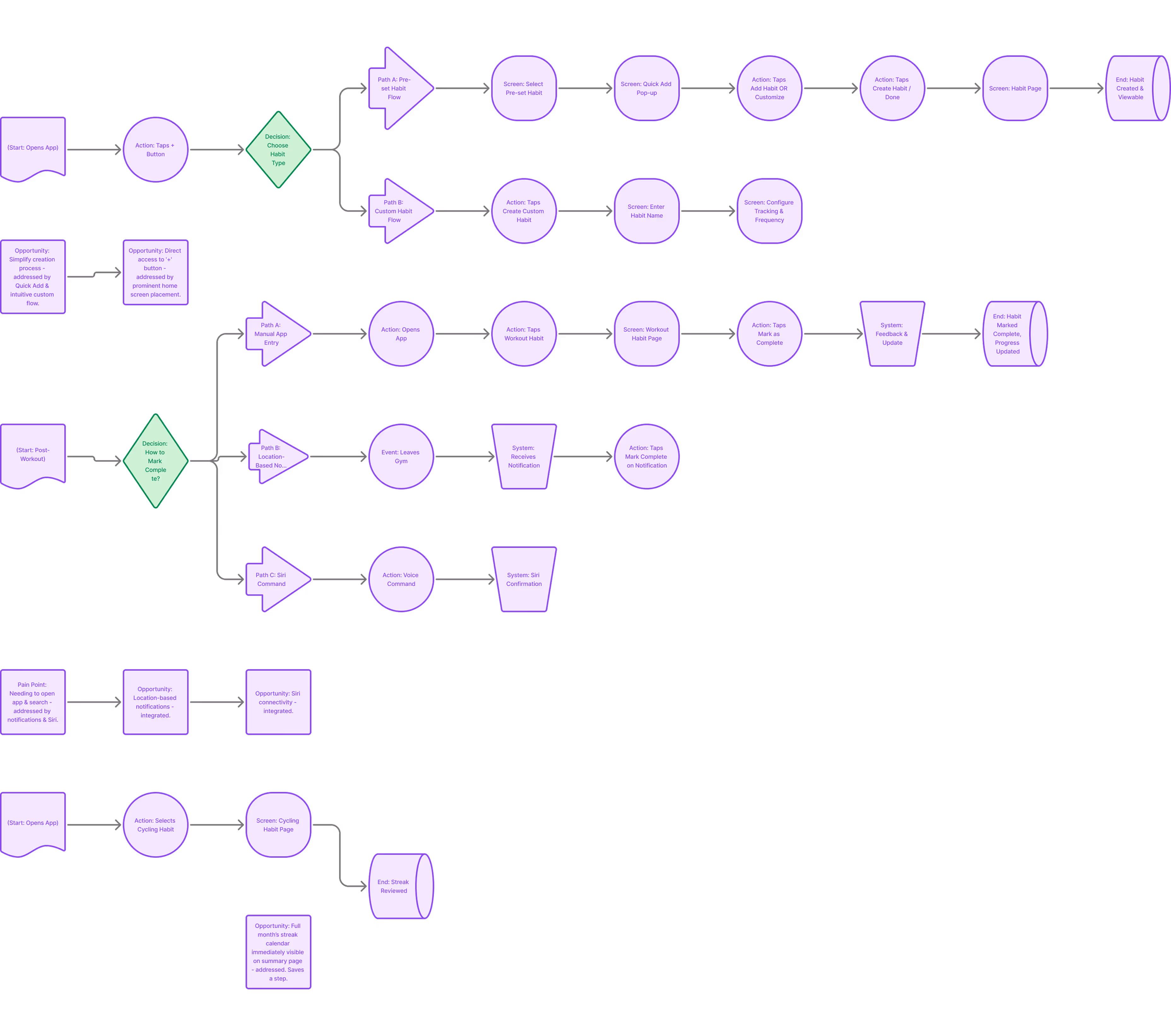
The Design Process
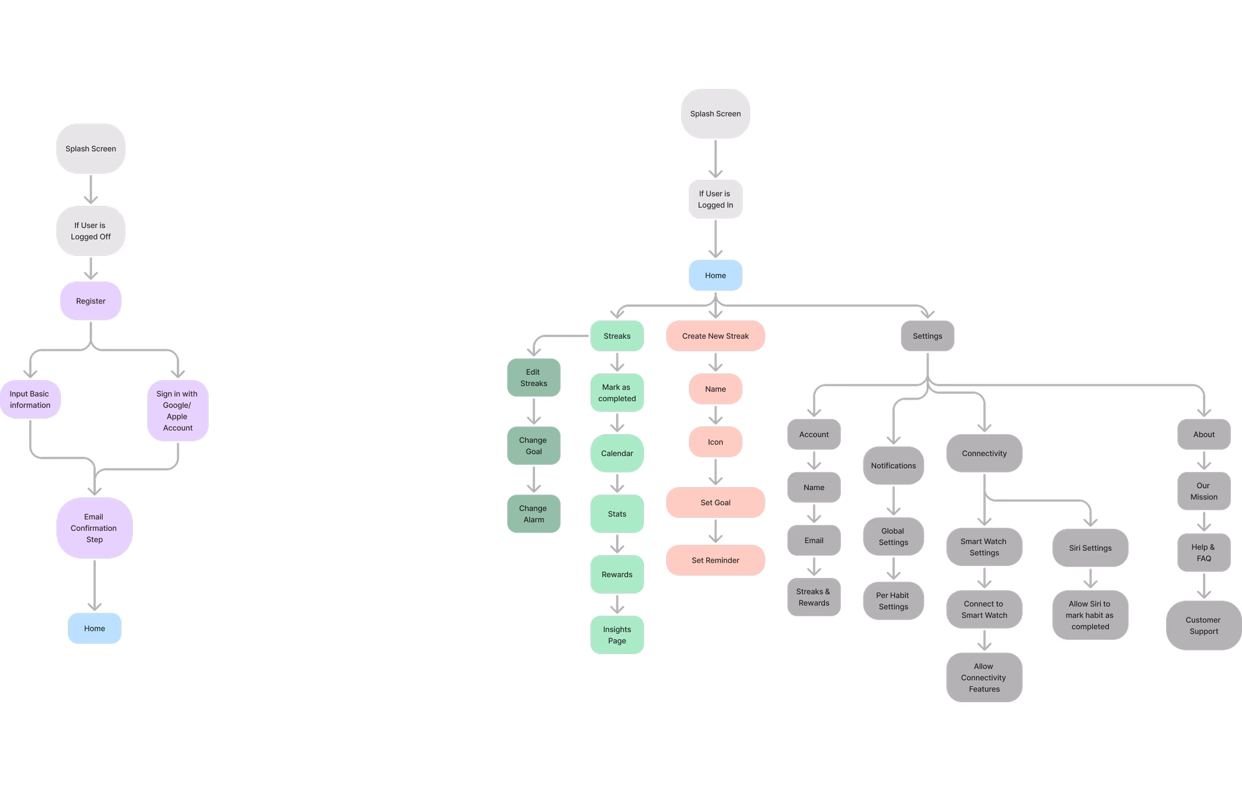
My design process followed a non-linear, iterative loop: Understanding ➔ Market Research ➔ Ideate ➔ Generate ➔ Test ➔ Feedback. This flexible structure allowed me to adapt my concepts constantly based on user insights and testing.
Research & Insights
I combined secondary behavioural research, such as the NHS finding that it takes an average of 66 days to form a new habit, with primary user surveys targeting busy adults.
71% of participants cited a lack of time and motivation as their biggest hurdle.
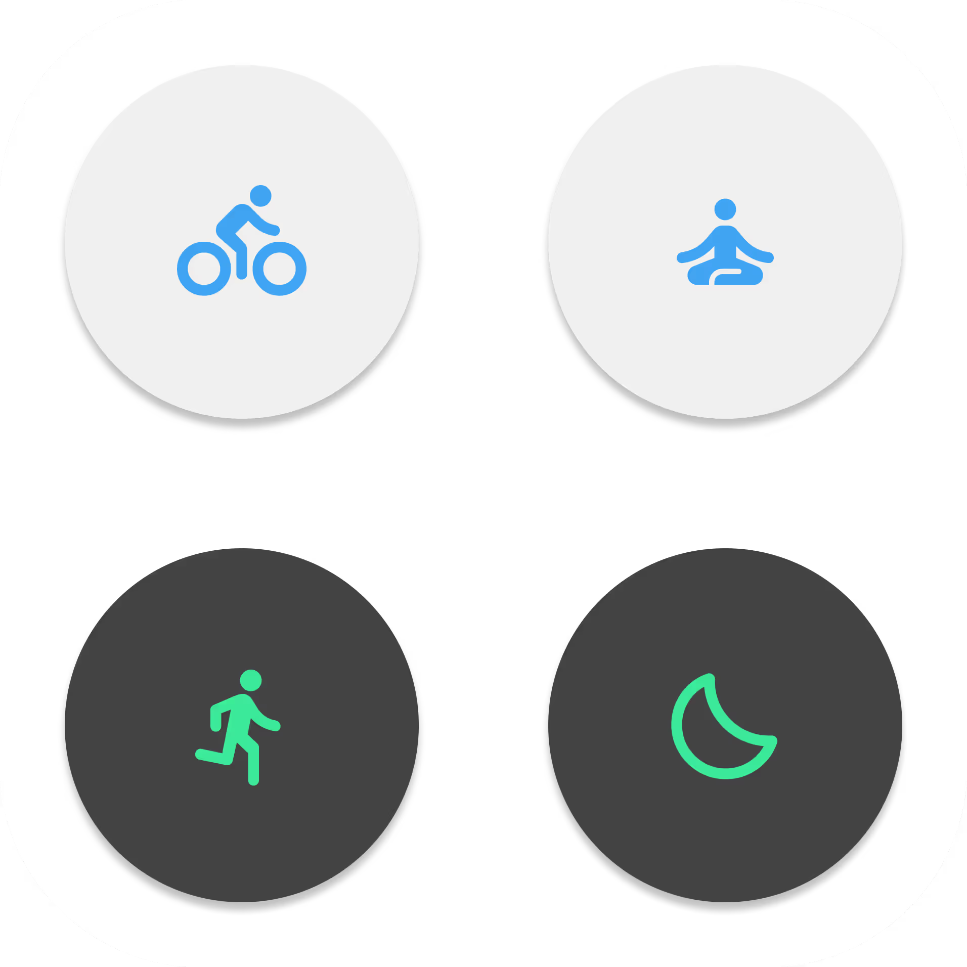
I utilized habit rings, as the visual act of "closing the ring" creates a satisfying psychological feedback loop, reinforcing consistency with just one tap.
40% found notification overload unhelpful, and 58% wanted a simple UI.
I stripped away complex menus. I even removed the in-app theme toggle, the app adapts to the user's OS settings, eliminating the need to spend time adjusting preferences.
Empathy & Personas
To ground my design decisions, I developed two primary personas:
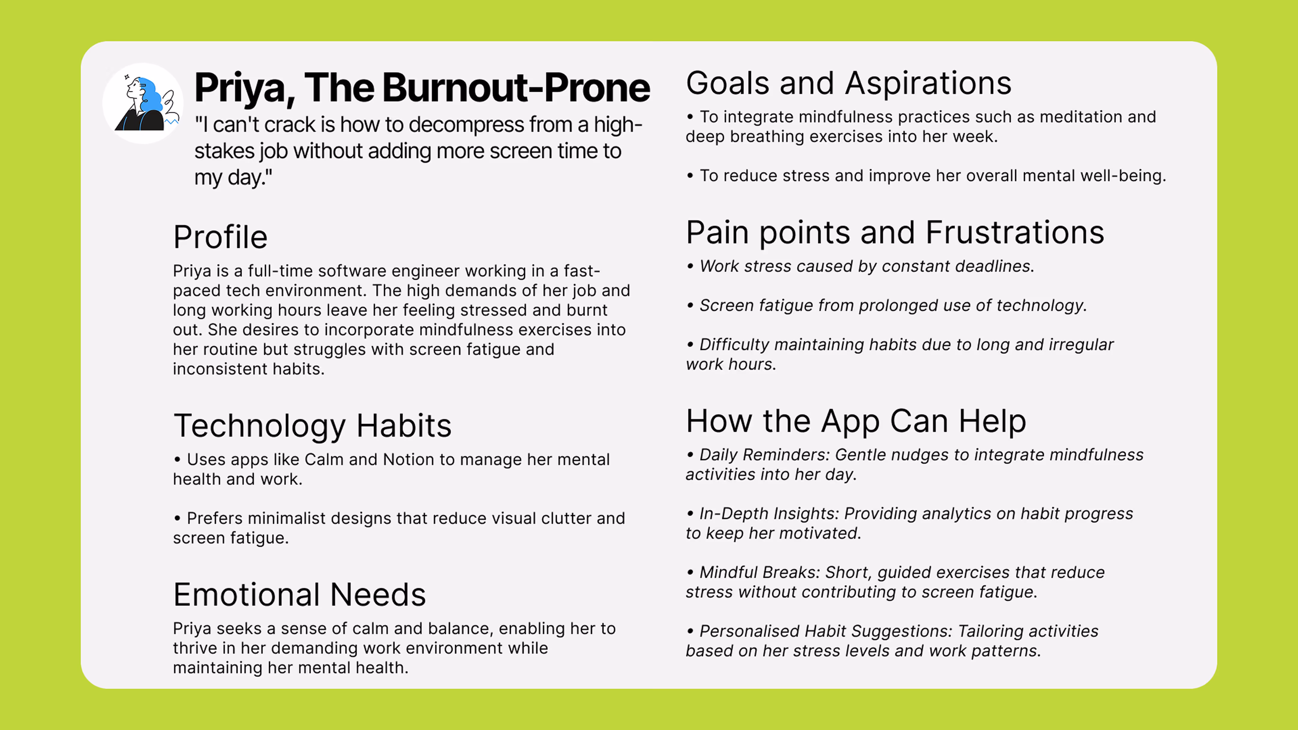
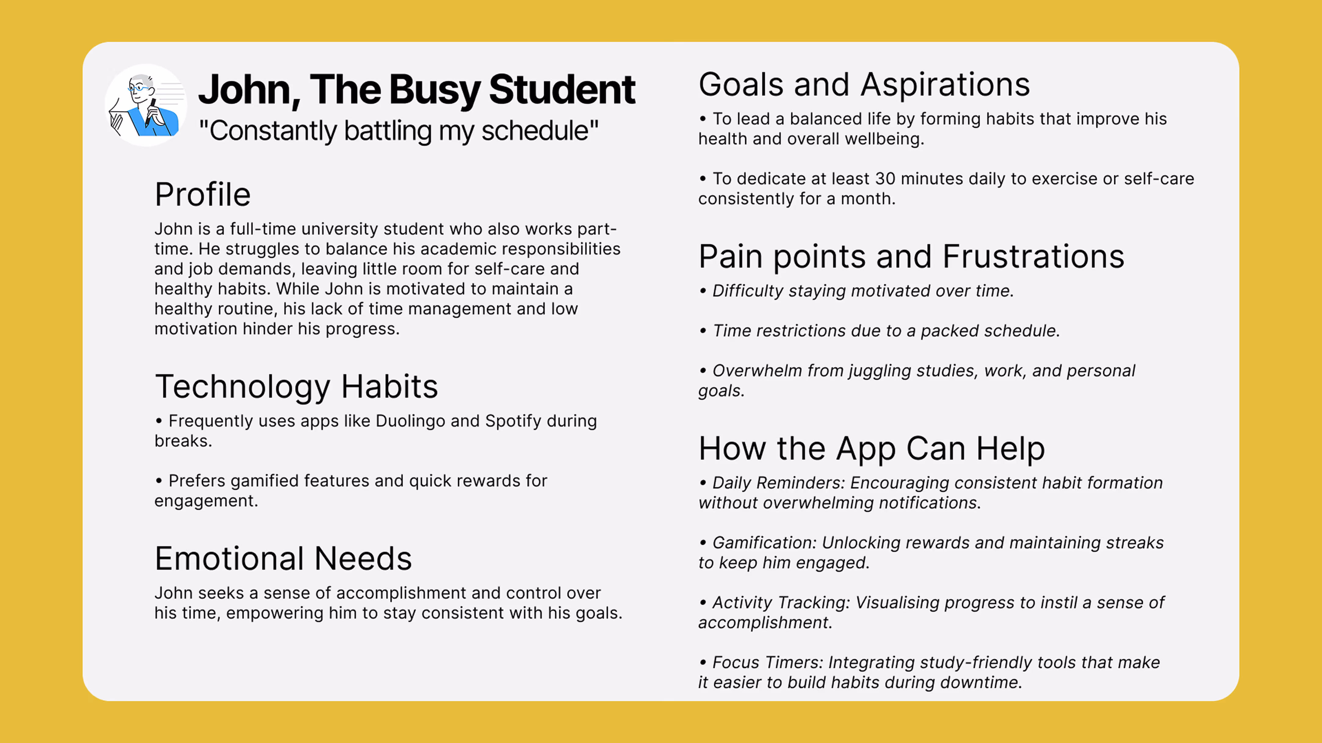
Mapping user flows for both John and Priya helped me find a balanced navigation system that met both of their emotional needs without overwhelming them.
Ideation & Iteration
I sketched multiple versions on paper to speed up the iteration process before moving into digital wireframes. The biggest evolution during this phase was the Home Screen.
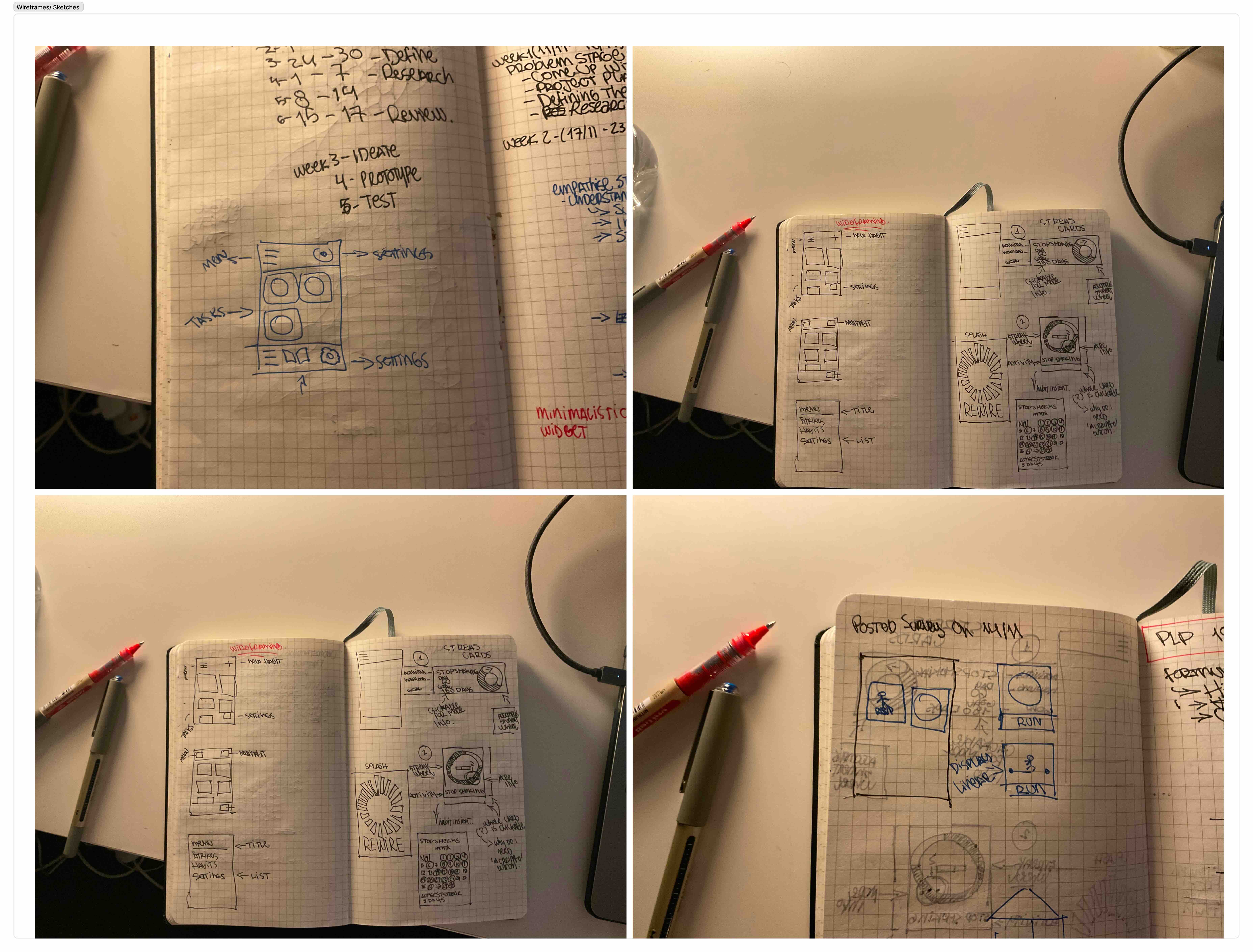
The Home Screen Evolution:I explored multiple directions to balance usability with the app's core philosophy of minimising screen time.
Swappable Cards: An early concept allowed extreme personalisation with swappable habit cards for rich insights. Result: Introduced unnecessary complexity and encouraged excessive interaction.
Text-Only Interface: A minimalist, to-do list approach with no icons or stats. Result: Felt too stripped back, lacking visual motivation and joy.
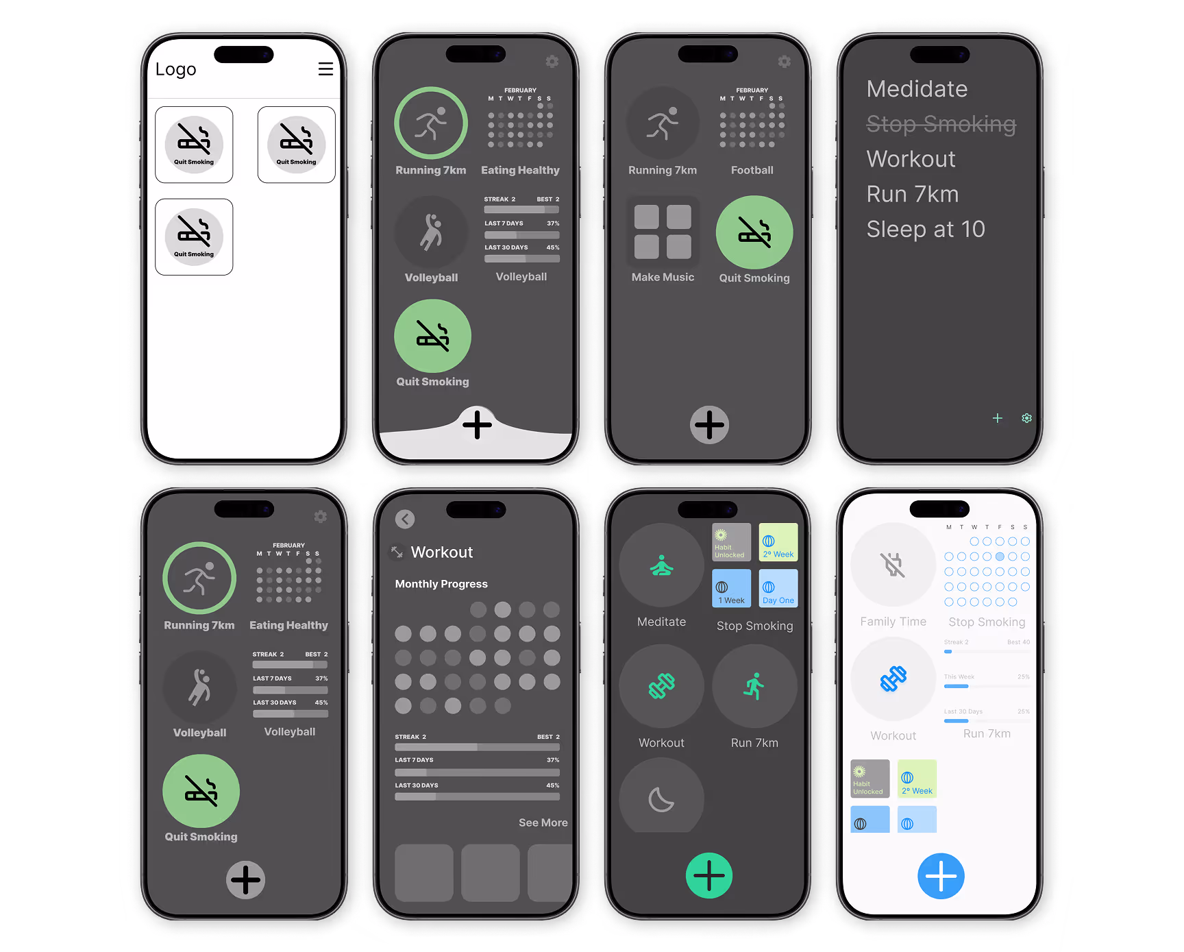
The Final Solution: A middle ground utilising a clean, icon-based home screen with completion rings. I intentionally removed home screen customisation to limit interactions and simply encourage users to check in, mark habits as done, and move on.
Design System
Every design choice in Habits was intentional, ensuring the interface served as a calm support platform.
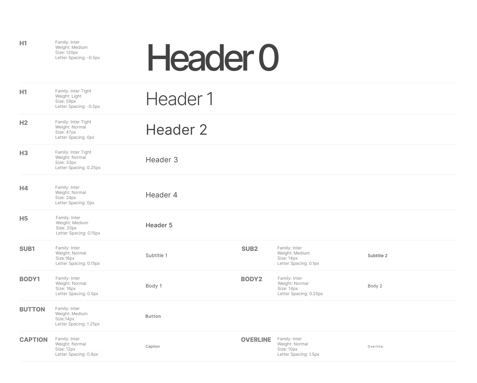
Typography: I utilised Inter and Inter Tight. As a highly readable web font designed for digital interfaces, Inter provides absolute clarity without competing with the UI's iconography.
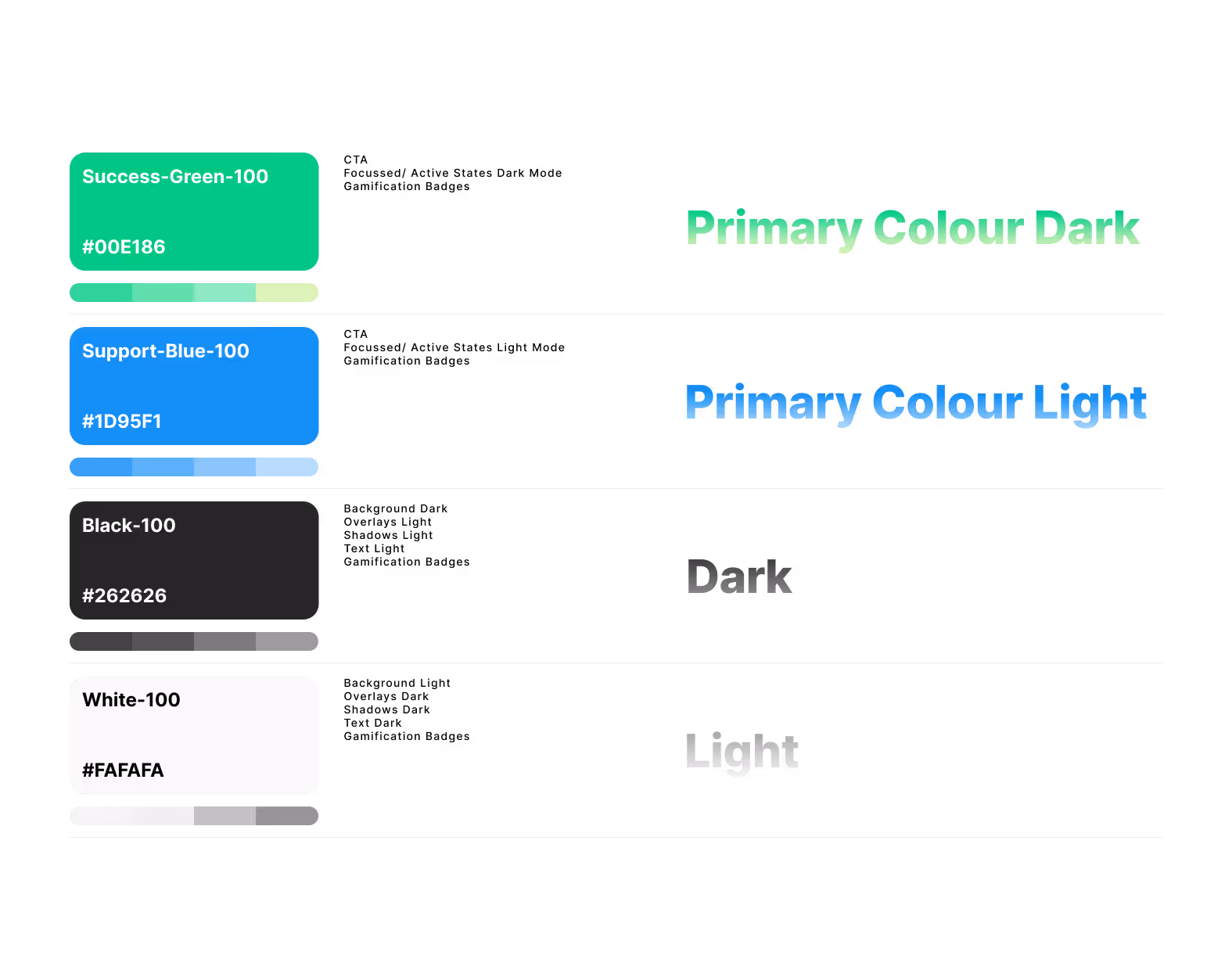
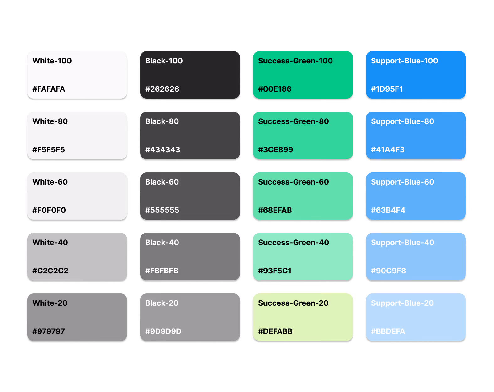
Colour Psychology: The palette relies on a neutral black and white foundation to reduce visual fatigue. Green (symbolising growth and success) and Blue (conveying calmness and support) were chosen to promote clarity and motivation.
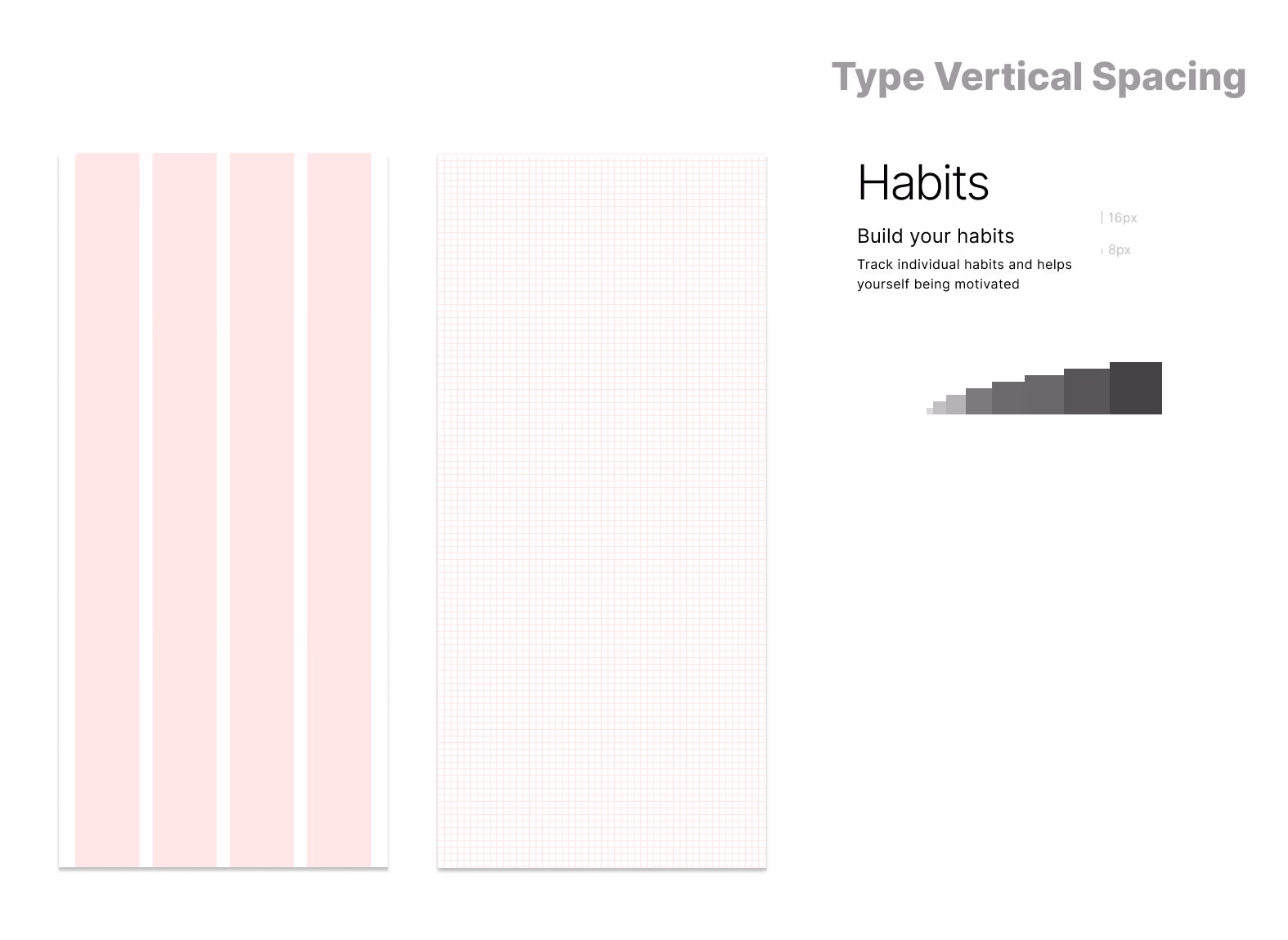
Development Readiness: The UI is built on a 4-column grid system with 16px gutters and an 8px baseline grid. Text vertical spacing follows a modular scale to promote visual hierarchy.
Key Features & UX Storytelling
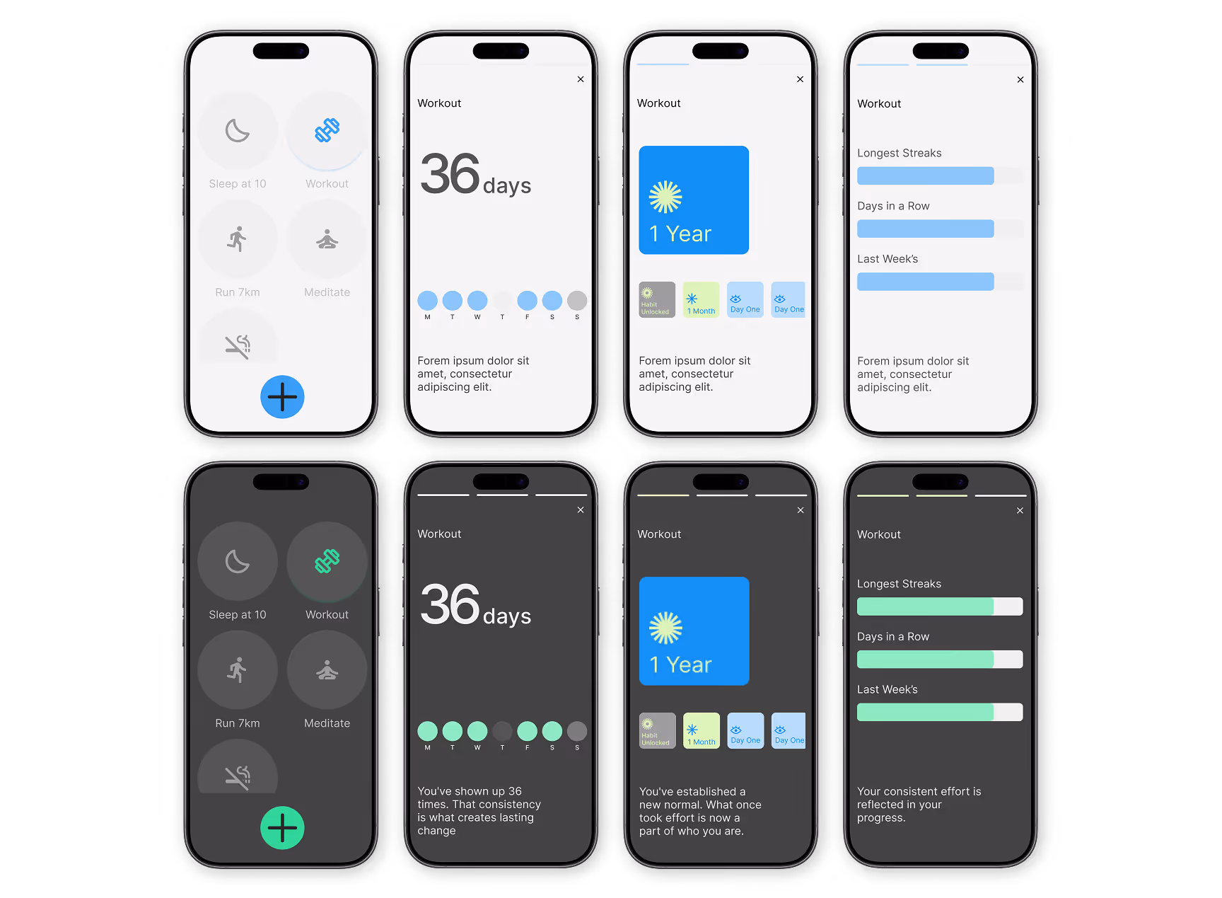
The "Story-Stats" Pivot
Initially, I planned to build traditional statistics pages. However, keeping users locked in the app to view their data contradicted my mission to minimise screen time.
I pivoted to a familiar, low-friction format: Instagram or Spotify-style "stories". Now, users simply long-press a habit to launch a quick, digestible story interface showing their streak and rewards. It satisfies their need for data at a glance, without trapping them in a complex dashboard.
Iterating on Gamification
Rewards are crucial for motivation. I originally was planning on designing highly polished, metallic badges inspired by Apple Fitness, aiming for a collectible feel.
During a WIP presentation, my lecturer Joe provided valuable feedback: a high-gloss style clashed with the app's mindful, minimal tone. I sketched multiple alternative styles and ultimately redesigned the badges using soft gradients and flat colours. The final outcome integrates seamlessly into the calm interface while still feeling emotionally rewarding.
Conclusion
Next Steps
As I look toward the future development of Habits, my focus remains on reducing friction:
Home/Lock Screen Widgets: Allowing users to mark habits as completed directly from their lock screen would make tracking completely effortless, allowing them to stay consistent without fully opening the app.
Key Learnings
While the user-centric research and behavioral psychology were the heart of Habits, the technical execution was where I experienced the most profound professional growth. Beyond the user-focused goals, I intentionally used this project to deepen my understanding of Figma's advanced design capabilities, specifically focusing on mastering Auto Layout, components, and variants.
The Power of Auto Layout
Overcoming the initial learning curve of Auto Layout fundamentally changed how I design. It shifted my mindset from simply placing elements on a canvas to structuring interfaces exactly how a front-end developer would build them using CSS Flexbox. It forced me to think logically about padding, responsiveness, and content wrapping.
System-Level Thinking with Variables & Components
Building this system with custom components, auto-layouts, and variables taught me the true value of scalability. By setting up strict spacing rules, typography scales, and a color system using variables, I realized how much faster and more consistent the iteration process becomes. Designing complex, multi-variant components, like the interactive Habit Rings and the adaptive story-stats, demonstrated how maintaining a single source of truth prevents inconsistencies across an entire app.
Designing for Developer Handoff
Ultimately, my goal was to deliver a 'ready-for-code' application. By paying close attention to structure, consistency, and design system logic, I wanted to ensure a smooth developer handoff and scalable implementation. This project taught me that good UX isn't just about the end-user it's also about the developer experience. Organizing clean, logical, and variable-driven files is a crucial soft skill I will carry forward into cross-functional teams.
Reflection
Habits challenged me to balance empathy with technical precision. It taught me that the best digital products are those that respect the user's time and mental space, backed by a robust, development-ready design system that makes building those products a reality.