



Beyond the Screen
Rethinking Our Relationship With Technology
At a Glance
Role
Researcher & Speculative Designer (Solo)
Timeline
12-Week Academic Term, 2024
Tools
Figma, FigJam, Google Forms, React, GitHub Pages
Project Overview
This trend report started as a scan of existing digital detox solutions and became a study of a quieter shift in values: from more time online to better time online. People aren’t stepping away from technology. They’re renegotiating their relationship with it.
Using strategic foresight methods alongside UX research, I traced signals across travel, hardware, health, education and work, surveyed 16 people about their habits, and translated the findings into a set of design principles, published as a mobile manifesto for fellow designers.

Research Goal
Understand why people are reshaping their relationship with technology, and what they want from it next.
Practice Goal
Learn to read signals, trends and drivers, and turn foresight into direction for design.
the signal
More connected than ever, and looking for balance
Screen time kept climbing after the pandemic. In the UK the average day now includes well over six hours of screens, and for many people it’s nine or more. Alongside that growth, a counter-movement has been gathering pace: not away from technology, but towards a more deliberate use of it.
54%
of British adults use screens more than they did before the pandemic
University of Leeds, 2022
62%
of 18–29 year-olds say they’re online almost constantly
Business Insider, 2024
+209%
bookings in a year for an off-grid digital detox cabin company
Unplugged, 2023–24
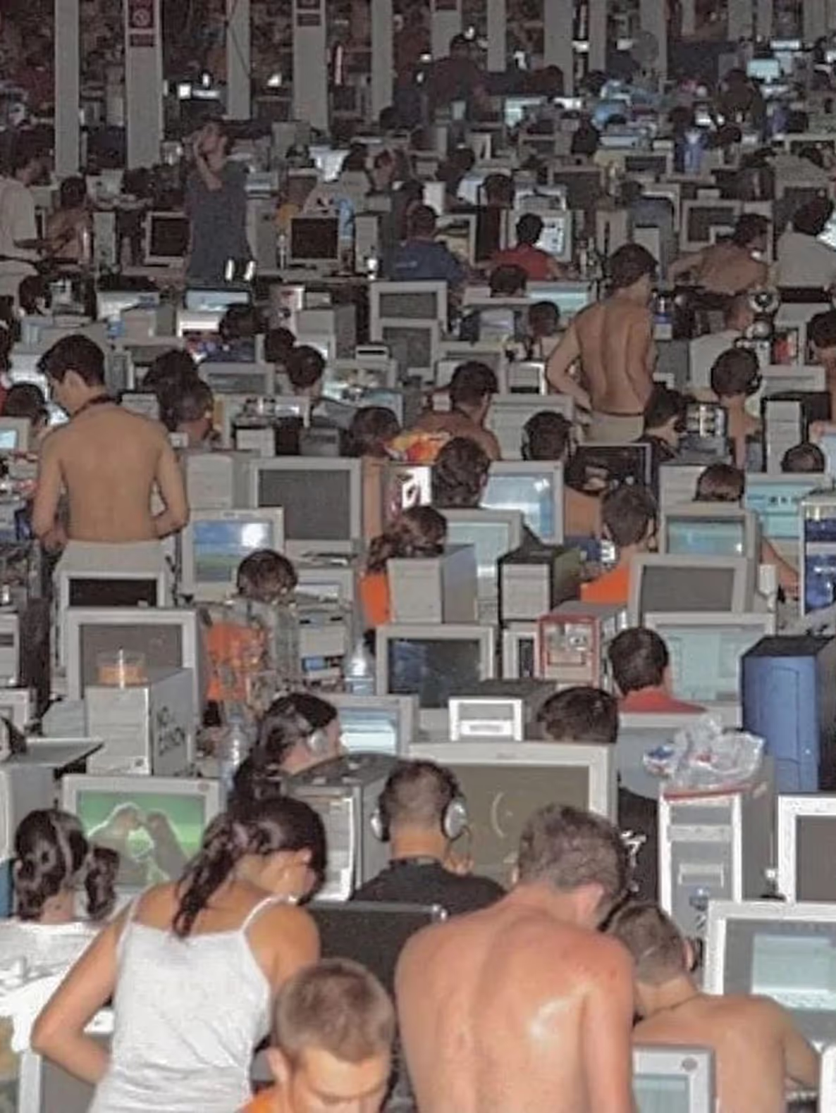
Hyperconnectivity as a shared, collective experience.
Research & foresight
Reading signals, trends and drivers
Following the futuring methods in How to Future (Kogan Page, 2020), I separated what I found into three layers: signals, small early changes; trends, patterns gaining momentum; and drivers, the forces behind them. Mapping them showed four territories moving in the same direction.
Territory
Signals
Trends
Drivers
Digital well-being
Rising burnout; more time on screens
Screen-time features; mindful tech use
Awareness of mental health; demand for work-life balance
Alternative lifestyles
“Dumb phone” resurgence; minimalist tech creators
Feature phones; app limits; social media fasts
Wanting control over screen time; slow living
Detox tourism
Travel sold as “screen-free”; resorts setting phones aside
Device-free zones; nature retreats; off-grid stays
Demand for mindful travel; a growing wellness industry
Simpler hardware
Light Phone, HMD and Fairphone launches
Repairable, single-purpose devices
Digital minimalism; e-waste awareness
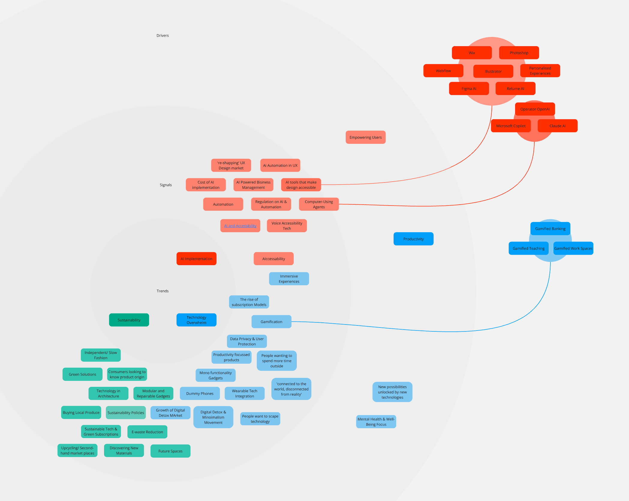
The first mind map: signals, trends and drivers around AI, productivity, sustainability and technology overwhelm, before narrowing the focus.
A PESTLE analysis widened the lens beyond products. It showed that this shift is being shaped as much by policy, cost and culture as by technology itself: school phone guidance on one side, the price of a retreat on the other.
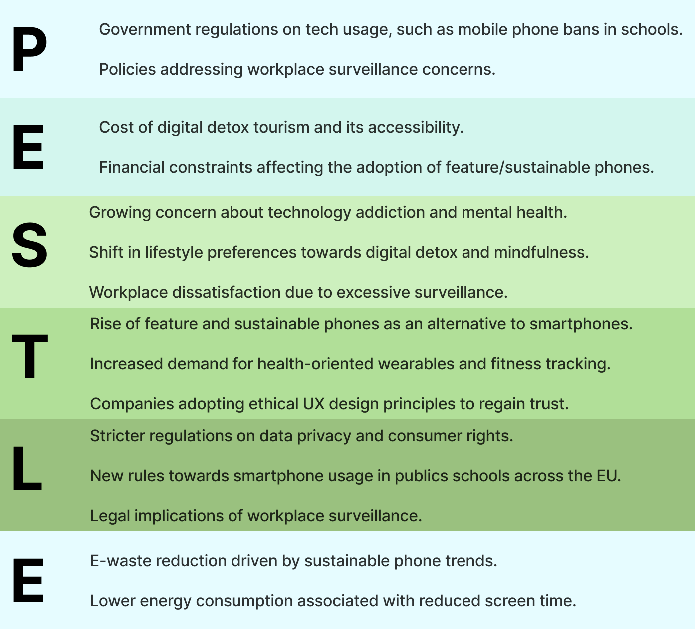
PESTLE analysis: political, economic, social, technological, legal and environmental forces behind the shift.
what people told me
Two surveys, sixteen voices
I ran two surveys: one on everyday digital habits (7 respondents, aged 25–44), and one on attitudes to switching off (9 respondents, mostly professionals in technology-heavy roles, including an engineer, a COO, project and account managers, an analyst and a science writer). The samples are small, so I read them for patterns and language rather than statistical weight.
Spend more than 6 hours a day on devices
86%
Feel overwhelmed by digital use at least sometimes
100%
Have never used an app to reduce screen time
71%
Would try a detox retreat, if convenient and affordable
83%
Expect switching off to become mainstream, at least in some circles
100%
Everyday habits survey (Typeform, February 2025).
The experience of switching off
“I felt more free.”
Full stack engineer
“More focus, more insight into where I’m going and where I should be going.”
Senior account manager
“Felt less stressed and more clear-headed.”
Science writer
“I felt refreshed after… every time I did a digital detox it was always very memorable.”
Marketing manager
The reality of staying connected
Nobody wanted to give technology up. The barrier mentioned again and again was work, and the solutions people wanted were smaller and more frequent than a holiday.
“I would rather look for a solution to help me switch off from social media and all the quick content and notifications.”
COO
“Maybe limiting your scrolling is a better approach for me.”
Analyst
“It’s realistic to have location-agnostic intermittent digital detoxes.”
Science writer
“Most jobs now, especially knowledge jobs or high paying ones, rely 100% or mostly on technology and the internet.”
Marketing manager
The pattern was consistent: people value what technology gives them. What they want is help choosing when to step back, not a choice between all or nothing.
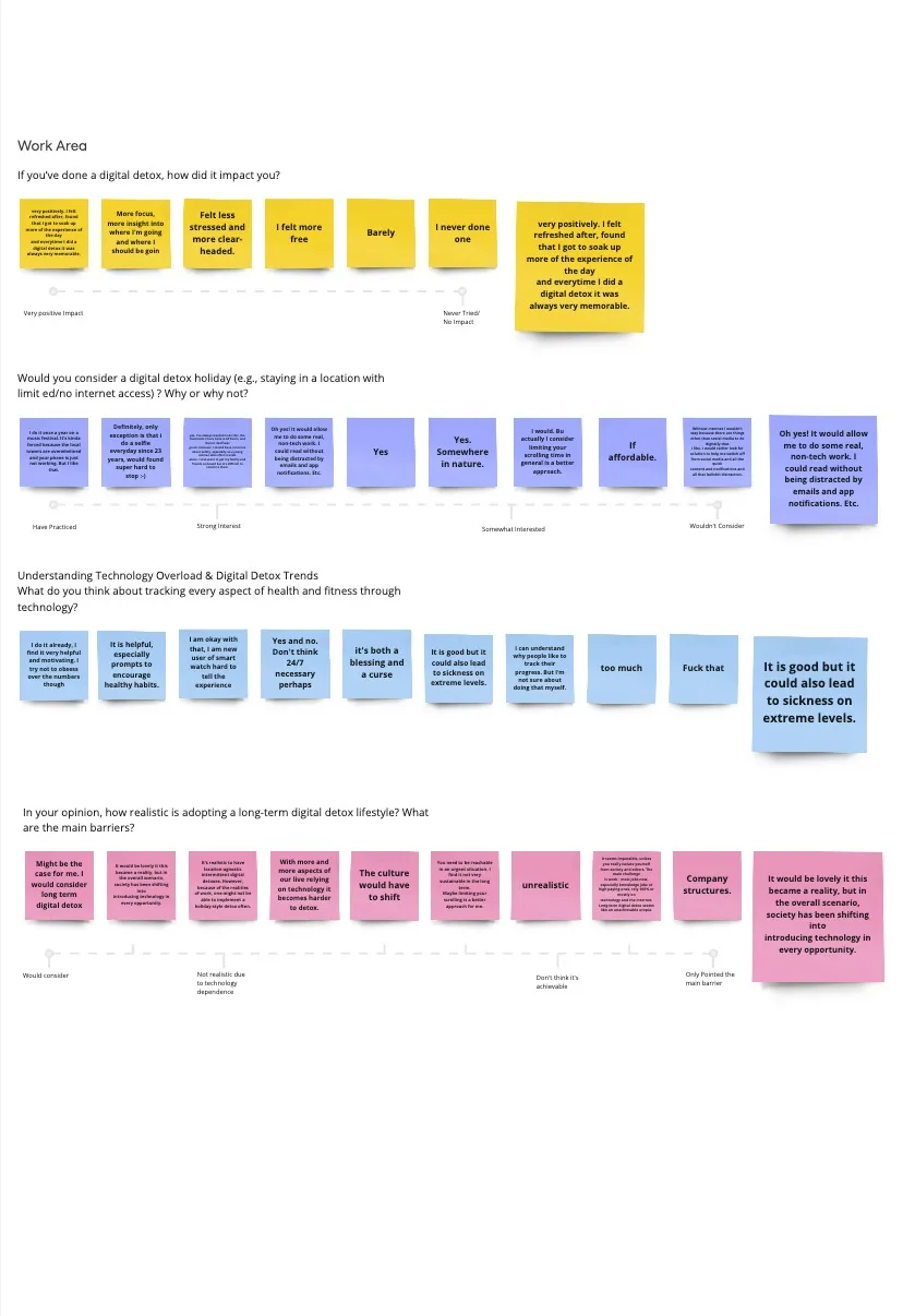
Affinity diagram: written answers placed on scales, from “very positive” to “not realistic”.
behaviour shifts
Five shifts in what people value
Bringing the signals and the voices together, five shifts stood out. Each one is a change in what people expect from technology, and an opening for the products that meet it.
01
From always on, to intentionally on
Connection by default → connection by choice
Research from the University of Greenwich found that switching off follows an emotional curve: a few anxious hours, then a sense of freedom and presence. Back online, people noticed the stream of notifications more, and many chose to disconnect more often. In my survey, 7 of 7 felt overwhelmed at least sometimes, yet 5 of 7 had never used a tool to help.
02
Simplicity becomes desirable
More features → the right features
Off-grid stays are booming: Unplugged reported 94% occupancy since July 2023, and searches for digital detox holidays rose 50% in 2024. With the average UK holiday budget around £2,000 and many retreats costing over £1,000, the opportunity is to bring that feeling into everyday life. 5 of 6 respondents would try a retreat, “if convenient and affordable”.
03
From always on, to intentionally on
Connection by default → connection by choice
Devices like the Light Phone, HMD’s Skyline and OffGrid, and the Fairphone are redefining what a good phone is: simple, repairable and long-lasting. Google searches for feature phones peaked in June 2024, when HMD announced the Skyline. 2 of 7 respondents said a minimalist phone was the method they’d most likely try.
04
Measuring well-being, mindfully
Personal willpower → shared agreements
Health wearables split opinion. People valued gentle prompts and progress, and were wary of numbers becoming the goal. One respondent called it “both a blessing and a curse”; another found tracking “very helpful and motivating” but tries “not to obsess over the numbers”.
05
Healthy boundaries become shared norms
Personal willpower → shared agreements
Boundaries are moving from individuals to institutions. France has restricted phones in schools since 2018, the Netherlands followed in January 2024, and the UK issued new guidance in February 2024, with Italy, Hungary, Belgium and Ireland taking similar steps. At work, employees increasingly expect transparency and consent around how digital tools observe them.

Calm, natural materials are becoming the visual language of well-being, from retreats to hotels, an approach known as neuroaesthetics.
the outcome
A manifesto for designing beyond the screen
The brief asked for a strategy for bringing future trends into practice. Rather than a single product, the research pointed to a change in how products will be judged, so I translated it into principles for fellow UX students: a mobile web manifesto, designed in Figma and built in React.
Breaking the rules on purpose
The layout was an experiment. I deliberately set aside conventions I’d normally follow: text runs edge to edge with no side margins, headlines are oversized and italic, and images interrupt the reading flow. A manifesto about rethinking how we design couldn’t look like every other screen. The friction is the point: a small prompt to notice the defaults we’ve stopped questioning.
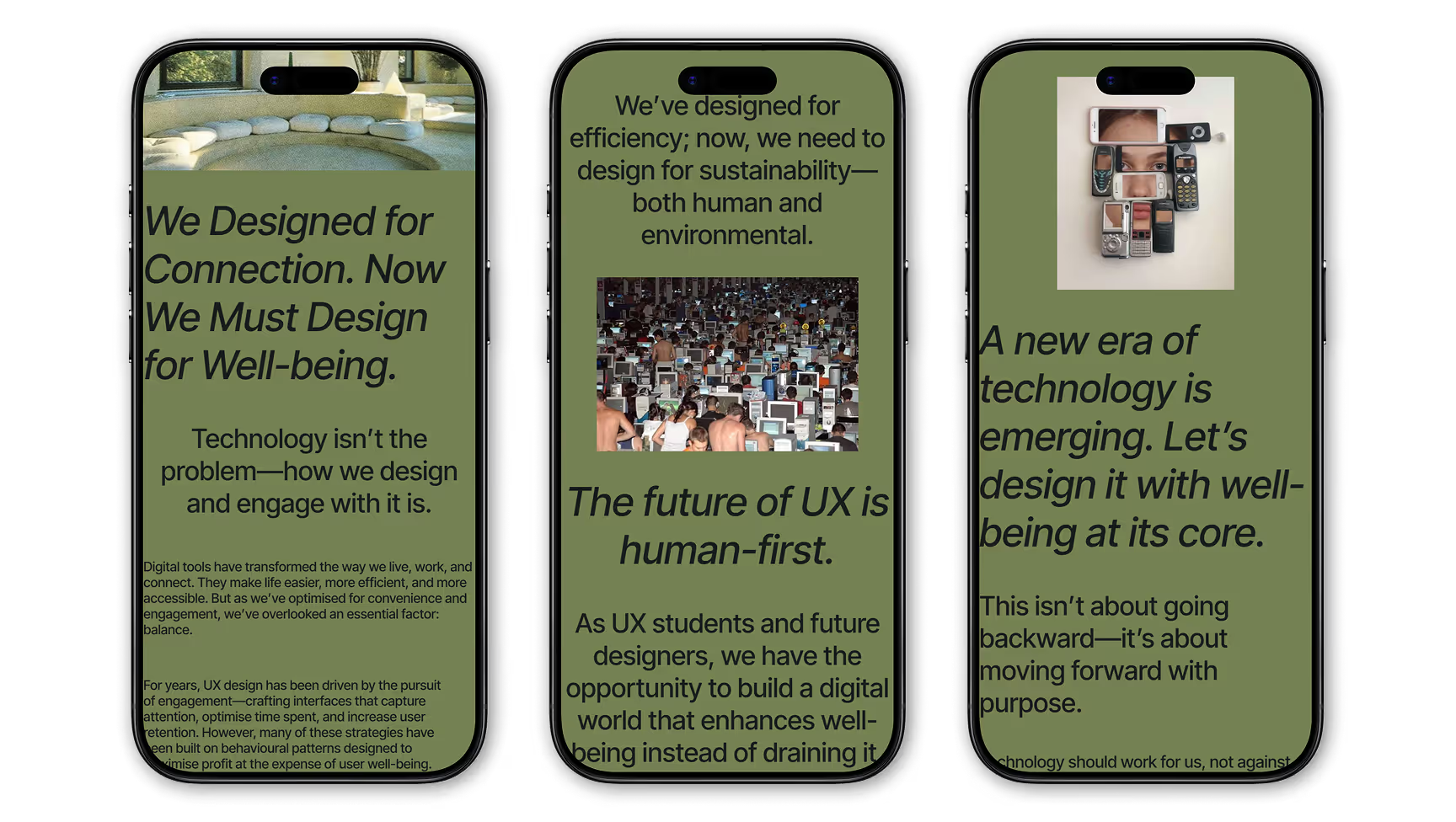
Six principles
- Design for balance. Guide people towards intentional engagement, and make stopping as easy as starting.
- Build well-being in. Make it part of the core experience, not a setting to find.
- Give people agency. Custom notifications, offline modes and clear controls let people set their own boundaries.
- Measure what helps. Health and habit data should encourage, not pressure.
- Design for longevity. Repairable, long-lasting products respect people and the planet.
- Respect attention at work. Transparent, consent-based tools that support focus.
reflection
From how I design to why I design
I started this project thinking of research as a way to make products easier to use. Tracing these signals showed me it’s also how designers notice where people’s values are heading, and that well-being is becoming a measure of a product’s quality rather than a constraint on it.
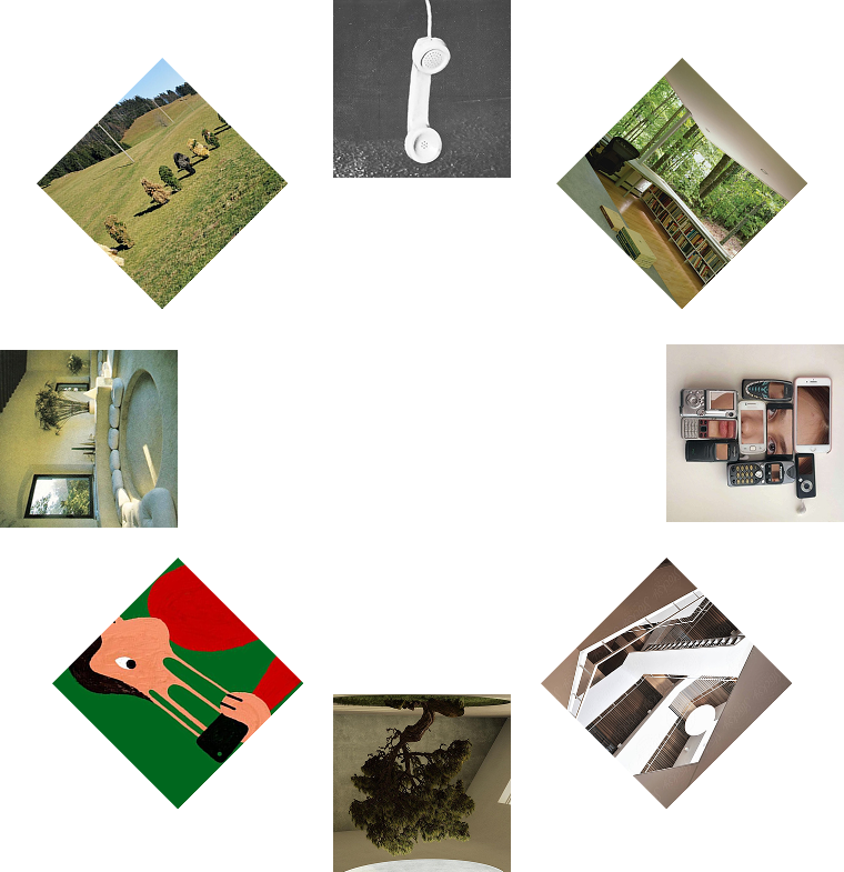
This research didn’t change how I design, it changed why I design.
Foresight as a design skill
Signal mapping and PESTLE felt abstract at first, building the mind map was the hardest part. But they gave the research a structure that surveys alone couldn’t, and pairing foresight with primary research meant every trend had a human voice behind it.
It also shaped where I want to take my practice: towards products like Opal, Light Phone and Minimal, and teams that design the time people spend away from the screen as carefully as the time they spend on it.